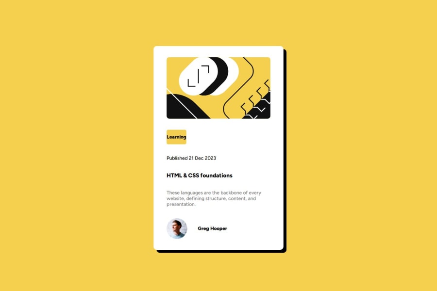


Design comparison

Solution retrospective
i did mobile fist
What challenges did you encounter, and how did you overcome them?no challenges encountered, it was a good practice
What specific areas of your project would you like help with?any feedback is appreciated
Community feedback
- @krushnasinnarkarPosted 9 months ago
Hi @jmortada,
Congratulations on successfully completing the challenge!
Your solution looks nice, though there are a couple of things you can improve which I hope will be helpful!
1. Using
max-widthfor.mainInstead of using percentage-based width and height for
.main, which is not a best practice, you can usemax-width: 400px;(or a width of your choice). This will give the card a fixed maximum width and reduce the card width if the screen size is smaller than the specified width..main { max-width: 400px; width: 100%; }2. Improving Content Alignment Inside
.mainThe technique you used for aligning content inside
.maincan be improved. Instead of using:justify-content: space-evenly; align-content: space-around; flex-wrap: wrap;You can use the
gapproperty to add gaps and padding for more effective alignment:.main { display: flex; flex-direction: column; gap: 20px; padding: 20px; }3. Adding Border and Increasing Border Radius
Add a border to
.mainand increase the border radius to make it more curvy at the corners:.main { border: 1px solid #ccc; border-radius: 15px; }Summary
- Use
max-widthfor.maininstead of percentage-based width. - Use the
gapproperty and padding for effective alignment inside.main. - Add a border and increase the border radius for a more polished look.
I hope you find this helpful, and I would greatly appreciate it if you could mark my comment as helpful if it was.Feel free to reach out if you have more questions or need further assistance.
Happy coding!
Marked as helpful0@jmortadaPosted 9 months ago@krushnasinnarkar thank u for the feedback I will definitely use those in the upcoming challenge although I am not familiar with (gap) I will look into it since it will prove useful again thanks for the feedback
0 - Use

Please log in to post a comment
Log in with GitHub
Join our Discord community
Join thousands of Frontend Mentor community members taking the challenges, sharing resources, helping each other, and chatting about all things front-end!
Join our Discord