Submitted about 1 year ago
Responsive blog preview card with vanilla HTML and CSS
#node#vite
@redstar504
Design comparison
SolutionDesign
Solution retrospective
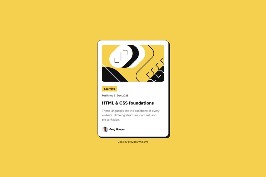
This is my implementation of the Blog Preview Card.
Some unique differences from my other solutions:
- Now using Vite to provide a local dev server, which provides auto reloading across all of my devices. This aids in quick testing on smaller screens.
- Deploying my solution to Render which is fast, and easy.
- Unrelated to tech, I have started forcing myself to use touch typing due to RSI pain in my wrist. Since I am brand new to it, it is irritatingly slow to type anything. I am improving quickly however.
I also subscribed to a pro plan on this website. Having the dimensions available on Figma is certainly a game changer.
Let me know if you notice any issues, or have any suggestions!
Community feedback
Please log in to post a comment
Log in with GitHubJoin our Discord community
Join thousands of Frontend Mentor community members taking the challenges, sharing resources, helping each other, and chatting about all things front-end!
Join our Discord
