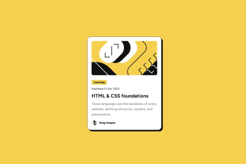
Responsive Blog Preview Card with no media queries

Solution retrospective
The main thing I learnt during this project was how to create a responsive layout using just flexbox and resizable text. Some new SCSS I used this time round was:
$Small: clamp(0.8em, 1.6vw, 1em);
$Med: clamp(1em, 2.2vw, 1.2em);
$Large: clamp(1.6em, 3vw, 1.8em);
Lots of fiddling to get the result I wanted and to make sure this looked right on all screen sizes. I originally tried to do this challenge with just vw font sizes but didn't have enough control so then used 'clamp' which seems to have done the job. Really pleased!
Also my first time using a transition on hover, which was a lot easier than I expected :)
What challenges did you encounter, and how did you overcome them?A few challenges with the layout, when using vw as the font-size. I changed to the clamp solution above and this helped the card shrink back down to a reasonable size. I'm still quite new to flexbox so also struggled to work out alignment and to get this centered horizontally without it being cut off, but think I achieved this in the end.
A big challenge to do this without any media queries at all, but really really pleased with how it turned out, flexbox is truly magic!
What specific areas of your project would you like help with?None, I'm happy with my solution. Always happy to receive comments/criticism though!
Please log in to post a comment
Log in with GitHubCommunity feedback
No feedback yet. Be the first to give feedback on Kay's solution.
Join our Discord community
Join thousands of Frontend Mentor community members taking the challenges, sharing resources, helping each other, and chatting about all things front-end!
Join our Discord