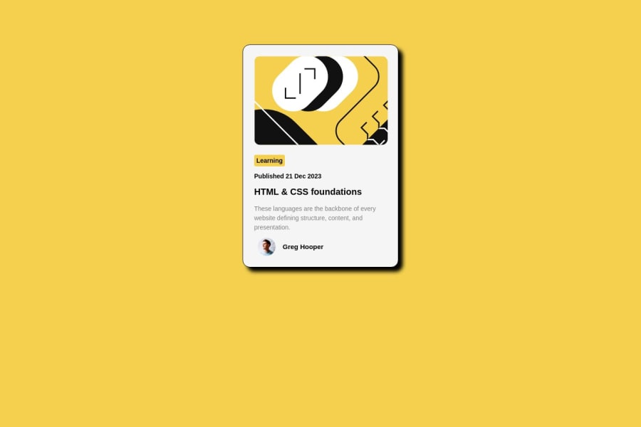
Design comparison
Solution retrospective
Check this out and give your honest comments.. thank you
Community feedback
- @PJIceskullPosted 11 months ago
Hey Edward, you did a pretty good job recreating the design! I like that you went out of your way to recreate the header image using SVG. You were very close to nailing it but you missed a few design elements.
Font
- First off, the font for your solution should be Figtree as stated in the style guide.
- The links for these fonts can be found in the source files you downloaded.
- You can find the files either locally in the assets folder or import them using Google Fonts.
Learning Button
- A nitpick but I think you should add more padding in your learning button.
Paragraph Text
- Your h1 and .date text seem to have the same fontweight. If you look at the design closely you see that h1 is much more bolder than the rest of the text.
Box Shadow
- You were close to getting this but the trick for your box shadow is that the blur value should be zero. For Example:
.container { box-shadow: 10px 10px 0px rgba(0,0,0,1); }
The third value holds the blur value and if you set that value to 0, you'll get a flat shape.
Hover State You were very close to getting the hover state right but you're missing an element. Where you hover over the card, the card's box shadow should increase! The change is simple as you have to add a :hover selector just like you did with your h1.
.container:hover { }
The only values you'll need to change are the x and y values of your box-shadow
0
Please log in to post a comment
Log in with GitHubJoin our Discord community
Join thousands of Frontend Mentor community members taking the challenges, sharing resources, helping each other, and chatting about all things front-end!
Join our Discord