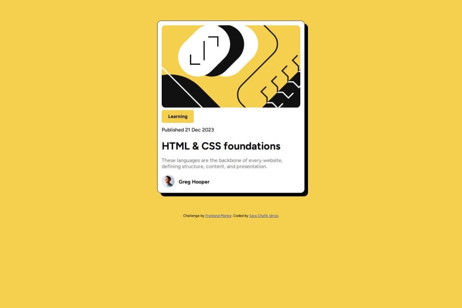
Design comparison
SolutionDesign
Solution retrospective
What are you most proud of, and what would you do differently next time?
i have done this challenge using flexbox this time
What challenges did you encounter, and how did you overcome them?i have encounter responsiveness challenge
What specific areas of your project would you like help with?i would like help with how to position elements of body
Community feedback
- @VakhoCloudPosted 8 months ago
Nice work, use CSS flex-box for layout and center card with it. wrap div container in main and use CSS flex-box. give main heigh: 100dvh. display: flex; justify-content: center; align-items: center;
Marked as helpful0@sarachafikidrissiPosted 8 months agoThanks @VakhoCloud for the feedback i appreciate it
0
Please log in to post a comment
Log in with GitHubJoin our Discord community
Join thousands of Frontend Mentor community members taking the challenges, sharing resources, helping each other, and chatting about all things front-end!
Join our Discord
