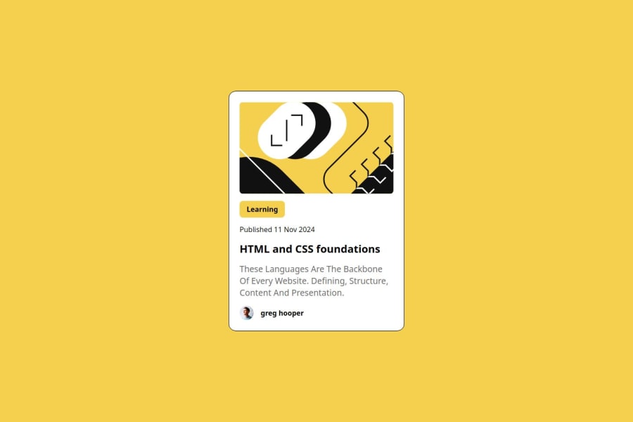
Design comparison
Solution retrospective
I am proud that i have completed this responsive blog preview card. i have learn a very basic and important concept in this project.
What challenges did you encounter, and how did you overcome them?I face challenge when i am giving width to this div when i am giving width in px it become non responsive but then i give width in percent. and other values in rem then it become responsive.
Please log in to post a comment
Log in with GitHubCommunity feedback
- P@rinta-git
You missed achieving the shadow for the card's right-bottom areas. Covering that will ensure that you almost covered the design requirements. You can do this by adding this style to your card class. filter: drop-shadow(8px 8px 0 rgba(0 0 0/100%));
When setting width, consider the space taken for padding, border, and/or margin; then the card size will become more accurate.
The font size used for the description sentence (the longer one) is different from the design; also consider changing those sentence casings. You can copy and paste the sentence from design if you are using Figma.
Join our Discord community
Join thousands of Frontend Mentor community members taking the challenges, sharing resources, helping each other, and chatting about all things front-end!
Join our Discord
