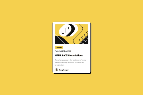
Responsive blog preview card using vh

Solution retrospective
I'm proud of how it came out i thought i wouldn't be abble to make it look that good- I'm also proud that this time i found out how to center the card without using any weird theqniques
What challenges did you encounter, and how did you overcome them?For me is a challenge make the font sizes smaller for mobile without media queries because i actually have no idea how to do that so i just used media queries instead for the moment. Another challenge I encountered was to make the hover title yellow without making all the texts yellow, I overcame that by assigning the color black directly to the other texts instead of leaving them black as default and I was able to achieve it.
What specific areas of your project would you like help with?i would like to know how to make font sizes smaller for mobile without using media queries
Please log in to post a comment
Log in with GitHubCommunity feedback
No feedback yet. Be the first to give feedback on Martinna Lazcano's solution.
Join our Discord community
Join thousands of Frontend Mentor community members taking the challenges, sharing resources, helping each other, and chatting about all things front-end!
Join our Discord