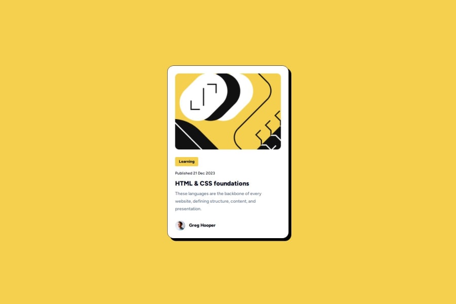
Responsive Blog Preview Card using TailwindCSS
Design comparison
Solution retrospective
I'm most proud of getting used to tailwind more, converting all the Figma styles used in the Figma download, and converting it to tailwind correctly. Next time, I would try to get the text to increase in size a bit more without using media queries because I did not read that in the "test yourself" section.
What challenges did you encounter, and how did you overcome them?The challenge that I encountered the most was trying to get the specific sizes for the card itself and the padding correctly in tailwind from memory without looking at the documentation. I overcame this problem by looking at the documentation again but most of the styling, I did from memory so I can tell I'm improving.
What specific areas of your project would you like help with?I would say I'm ok for now with basic stuff like this but I know I'm going to have a lot more questions regarding help and feedback as I move onto landing pages and more fleshed-out web pages but I'm thankful for the challenge nonetheless as this is great for getting me used to tailwind.
Community feedback
Please log in to post a comment
Log in with GitHubJoin our Discord community
Join thousands of Frontend Mentor community members taking the challenges, sharing resources, helping each other, and chatting about all things front-end!
Join our Discord
