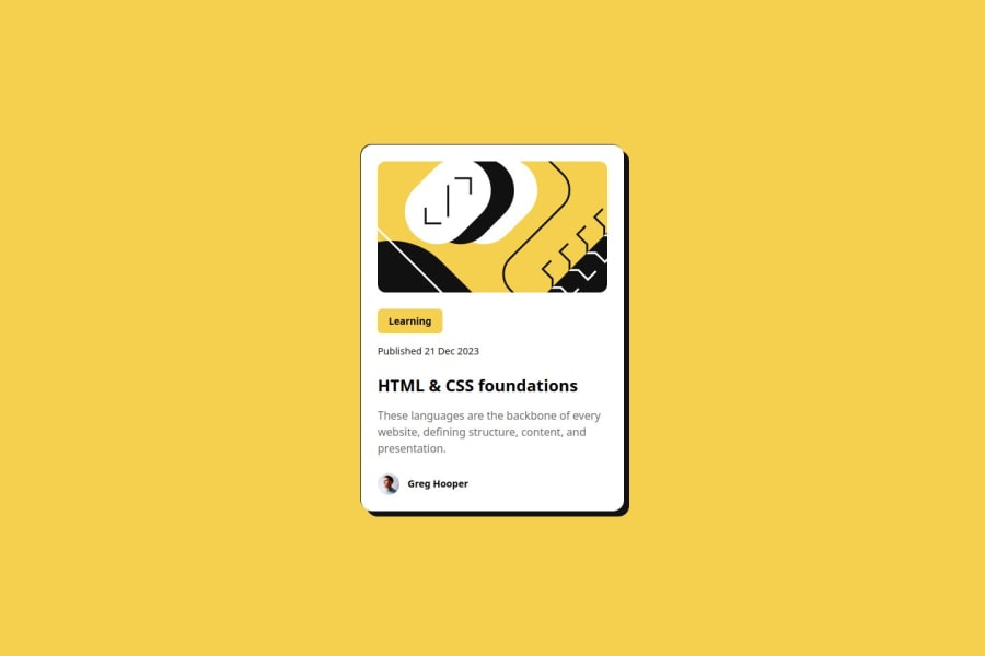
Responsive blog preview card using Tailwind CSS


Design comparison

Solution retrospective
Learning more about Tailwind CSS, and learning how the box shadow property works!
What challenges did you encounter, and how did you overcome them?- Adding custom local fonts. I overcame this challenge by googling and following Tailwind CSS documentation.
It was mentioned not to use media queries in the challenge, however I used media queries to match the design. I searched on how to create responsive text without the use of media query and stumbled upon the clamp() function and the (vw, vh, vmax, and vmin) CSS units. I did not know how to exactly apply them to the design. It would be great to know how to achieve responsive text without using media queries!
Community feedback
- @Dhruvmehta1311Posted 8 months ago
The shadow looks dope man.
0 - P@O-Julia-OPosted 8 months ago
Great work!
0@whawariPosted 8 months ago@O-Julia-O Thank you Yuliya! Any suggestions on how to create responsive text without the use of media queries?
0P@O-Julia-OPosted 8 months ago@whawari I believe, we are not suppose to do it, it is only second challenge in "Learning Path". :)
0P@O-Julia-OPosted 8 months ago@whawari and, I've just reviewed my work, and it even not looks similar to design :D So i don't have any ideas how we could do that without the use of media queries :o
0@whawariPosted 8 months ago@O-Julia-O Keep learning and going strong and soon you will
1@Dhruvmehta1311Posted 8 months agoUse Tailwind. It helps pretty much with responsiveness. Avoid using static height or width use min height and max width instead. Atleast that's what I follow. @whawari
1@whawariPosted 8 months ago@Dhruvmehta1311 Could not agree more. For starters I would suggest learning CSS on its own then after getting the hang of it you can move to Tailwind, that is what I did. I applied the min-height and max-width on my designs to ensure better responsiveness. The only challenge was to achieve text responsiveness without media queries. Using the CSS clamp() function you can achieve it, however I was too lazy to add it. I wanted to discover what other people are using.
0


Please log in to post a comment
Log in with GitHub
Join our Discord community
Join thousands of Frontend Mentor community members taking the challenges, sharing resources, helping each other, and chatting about all things front-end!
Join our Discord