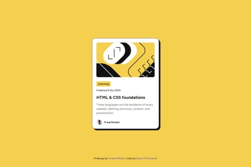
Submitted about 1 year agoA solution to the Blog preview card challenge
Responsive blog preview card using Tailwind and NextJS 15
react, tailwind-css

@ayPromise
Solution retrospective
What are you most proud of, and what would you do differently next time?
Well, the blog preview card looks great, I like it.
What challenges did you encounter, and how did you overcome them?component from the built-in "next/image" is not so easy to style doing responsivness. Next time I will avoid using "width/height" properties then use "style" one instead.
What specific areas of your project would you like help with?Maybe I still have uncertain philosophy in using const numbers for responsivness. This time I styled sizes due to screen sizes without rems and ems at all.
Code
Loading...
Please log in to post a comment
Log in with GitHubCommunity feedback
No feedback yet. Be the first to give feedback on ayPromise's solution.
Join our Discord community
Join thousands of Frontend Mentor community members taking the challenges, sharing resources, helping each other, and chatting about all things front-end!
Join our Discord