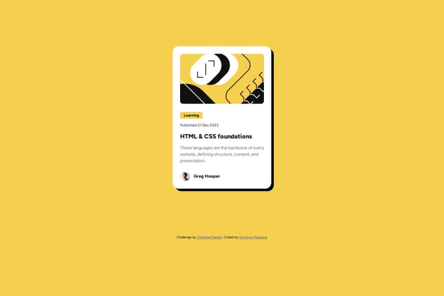
Responsive Blog Preview Card using Semantic HTML, Flexbox, and CSS Cus
Design comparison
Solution retrospective
I’m proud of implementing responsive design and accessibility features in the blog preview card, enhancing user experience through semantic HTML5 and clear hover and focus states.
Next time, I’d focus on refining the design based on user feedback and experiment with more advanced CSS techniques for layout control.
What challenges did you encounter, and how did you overcome them?I faced a challenge with embedding an already downloaded font into my project. To overcome this, I researched the correct @font-face syntax and adjusted the paths to ensure the font files loaded correctly.
What specific areas of your project would you like help with?-
Accessibility: How can I improve accessibility for screen readers in my project?
-
Font Embedding: What’s the best way to ensure the custom fonts I’ve downloaded are properly embedded and displayed in my project?
Community feedback
- @Ahmed-Abdul-ghaffarPosted 6 months ago
hi, nice work with creating the challenge and overcoming the challenges you faced, Here are some advices ..
- To improve accessibility for screen readers in your project, you can consider the following tips:
- Use Semantic HTML: Ensure you're using appropriate HTML elements for structure and meaning. Elements like
<header>,<nav>,<main>,<article>,<section>, and<footer>help screen readers understand the page structure better.
<header>
  <h1>Blog Preview Card</h1>
</header>
and the better thing here in frontend mentor give an alert in the accessibility report if you did not use
<main>in your project.- Add
altText for Images: Provide meaningfulalttext for images to describe their content to users who rely on screen readers. For decorative images, you can use an empty alt attribute (alt="") so screen readers will skip them.
<img src="author.jpg" alt="Photo of Greg Hooper, the article's author">- Use Headings Hierarchically: Organize your content with proper heading levels. For example, start with
<h1>(and include only one), followed by<h2>, and so on. This helps screen readers provide context for the content structure.
and you can check this for more details: https://www.w3.org/WAI/standards-guidelines/wcag/
2.As for your second question:
-
as you did with your project, you should use
@font-facerule and make sure you include different font formats (e.g., WOFF, WOFF2, TTF) to ensure cross-browser compatibility. -
Font Formats: Use WOFF and WOFF2 formats as they are optimized for web usage, providing good compression and wide browser support. TTF and OTF are also commonly used but less efficient for web performance.
-
Include Fallback Fonts: Always specify a generic fallback font in case the custom font fails to load. This ensures that the text is still readable, though with a different font.
body { font-family: "MyCustomFont", Arial, sans-serif; }-
Optimize File Sizes: Custom fonts can increase your page load time. Compress fonts to reduce file size and ensure faster loading, especially for mobile users.
-
Use Font Subsetting: If your custom font contains many characters that you don’t need, consider subsetting the font to only include the characters used on your website. This can significantly reduce file sizes. and you can do it with this project as it's very simple and dosen't need many character set.
and finally with the design, I think there is no any changes when hovering on "HTML & CSS foundations" except its color will change but the
box-shadowshould still fixed0
Please log in to post a comment
Log in with GitHubJoin our Discord community
Join thousands of Frontend Mentor community members taking the challenges, sharing resources, helping each other, and chatting about all things front-end!
Join our Discord
