Submitted 4 months ago
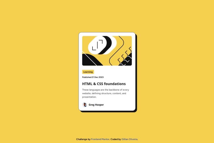
Responsive Blog Preview Card Using Only HTML and CSS
#accessibility#pure-css

P
@lia-oliveira

Design comparison
SolutionDesign

Solution retrospective
What are you most proud of, and what would you do differently next time?
I believe I have improved in terms of responsiveness. The card does not break even when it reaches a relatively small size, like 320px screen width, which I consider an achievement.
Perhaps it would have been easier to position the elements by organizing the grid into rows rather than columns.
What challenges did you encounter, and how did you overcome them?- Centering the card on the screen.
- Preventing the image from overflowing the container when the screen becomes too small.
- Ensuring the mobile layout takes up the entire screen.
I would love to know if there is a 100% free tool to test website accessibility. I've found a few online, but they only had a trial and a paid version.
I would also appreciate tips on how to combine CSS Grid and Flexbox.
Any general HTML and CSS tips are also welcome.
Community feedback
Please log in to post a comment
Log in with GitHub
Join our Discord community
Join thousands of Frontend Mentor community members taking the challenges, sharing resources, helping each other, and chatting about all things front-end!
Join our Discord