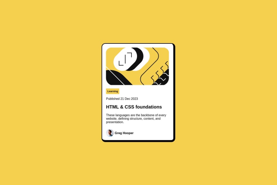
Responsive Blog preview card using only flexbox
Design comparison
Solution retrospective
I am a Newbie and this is my first challenge. If you find any mistakes or any other way that I can do this more efficiently please let me know, that'll be so helpful
Community feedback
- @danielmrz-devPosted 11 months ago
Hello @ksbr0000!
Your solution looks great!
I have a couple of suggestions for improvement:
- For semantic reasons, here's a guide for HTML headings use:
The
<h1>to<h6>tags are used to define HTML headings.<h1>defines the most important heading.<h6>defines the least important heading. Only use one<h1>per page - this should represent the main heading/subject for the whole page. Also, do not skip heading levels - start with<h1>, then use<h2>, and so on.- Also, still about semantic HTML, you can replace your
div.containerwithmain.container. All these changes may have little or no visual impact but they make your HTML code more semantic and improve SEO optimization as well as the accessibility of your project.
I hope it helps!
Other than that, great job!
0@ksbr0000Posted 11 months ago@danielmrz-dev This was the best I could with my current knowledge, but I intend to submit a new answer when I learn how to fix it 😊, Thank You so much for your advice 💖
0
Please log in to post a comment
Log in with GitHubJoin our Discord community
Join thousands of Frontend Mentor community members taking the challenges, sharing resources, helping each other, and chatting about all things front-end!
Join our Discord
