Submitted 3 months ago
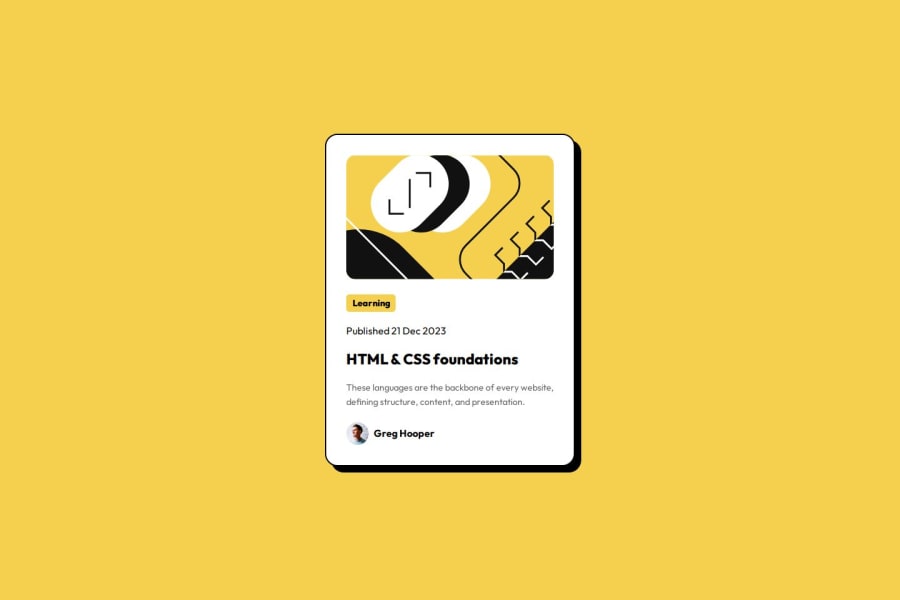
Responsive blog preview card using HTML and CSS

@mirajkar-dhruv

Design comparison
SolutionDesign

Solution retrospective
What challenges did you encounter, and how did you overcome them?
Making the card responsive was challenging. But I was able to make it responsive for mobile screen sizes using clamp() and relative sizes in CSS.
What specific areas of your project would you like help with?Any suggestions would be really helpful!
Community feedback
- P@TranDanh1122Posted 3 months ago
- no need br add all because div is block element, in default, onle 1 block in 1 row, so no need br
- use :root{} to setup all your color as a variable, so use variable when you need color, that make you code look better 3."Figtree" i dont see where this font use, you must import only font you using, because that performance issue
- you class, dont use id, because in real life, project will have multil card, right?, so class selector will help you re-use css
- image element need object fit, that will helpfull if you have image not fit with the frame
Marked as helpful1

Please log in to post a comment
Log in with GitHub
Join our Discord community
Join thousands of Frontend Mentor community members taking the challenges, sharing resources, helping each other, and chatting about all things front-end!
Join our Discord