Submitted 9 months ago
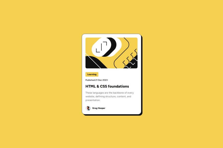
Responsive Blog preview card using Flexbox, bem and SCSS
#sass/scss#bem

P
@DalaScript

Design comparison
SolutionDesign

Solution retrospective
What are you most proud of, and what would you do differently next time?
- There were no particular difficulties; it was a simple task. 👍
- Next time, I will take a closer look at the design and try to write more comments in my code. 🧐📝
- There were no special challenges; it was a straightforward design card. 🃏✨
- Everything went smoothly, and I was able to implement the design without any issues. 🌟
- In this project, everything was clear to me. ✔️
- However, I'd love to get advice from others on what I could have done better. 🧩👨🏫
- Feedback on my approach and any suggestions for improving my work would be greatly appreciated. 🌟💬
Community feedback
Please log in to post a comment
Log in with GitHub
Join our Discord community
Join thousands of Frontend Mentor community members taking the challenges, sharing resources, helping each other, and chatting about all things front-end!
Join our Discord