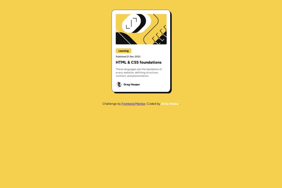
Responsive blog preview card using flexbox and hover effect etc


Design comparison

Solution retrospective
When i take a look at what my code could be it blows my mind, i don't have any regrets at the moment so i can't think of what i could do differently next time.
What challenges did you encounter, and how did you overcome them?None
Community feedback
- @SvitlanaSuslenkovaPosted 7 months ago
body { display: flex; flex-direction: column; justify-content: center; align-items: center; min-height: 100vh; } Try this to align(top-bottom) and justify(left-right) your project to the center. It applies to the parent component(body), don't forget about !!min-height!!. You can use grid instead of flex too.
Marked as helpful0 - P@StroudyPosted 7 months ago
Awesome job tackling this challenge! You’re doing amazing, and I wanted to share a couple of suggestions that might help refine your approach…
-
Having a clear and descriptive
alttext for images is important because it helps people who use screen readers understand the content, making your site more accessible. It also improves SEO, as search engines usealttext to understand the image's context, helping your site rank better, Check this out Write helpful Alt Text to describe images, -
Using a full modern CSS reset is beneficial because it removes default browser styling, creating a consistent starting point for your design across all browsers. It helps avoid unexpected layout issues and makes your styles more predictable, ensuring a uniform appearance on different devices and platforms, check out this site for a Full modern reset
-
I think you can benefit from using a naming convention like BEM (Block, Element, Modifier) is beneficial because it makes your CSS more organized, readable, and easier to maintain. BEM helps you clearly understand the purpose of each class, avoid naming conflicts, and create reusable components, leading to a more scalable codebase. For more details BEM,
-
Developers should avoid using pixels (
px) because they are a fixed size and don't scale well on different devices. Instead, useremorem, which are relative units that adjust based on user settings, making your design more flexible, responsive, and accessible. For more information check out this, Why font-size must NEVER be in pixels or this video by Kevin Powell CSS em and rem explained.- Another great resource for px to rem converter. -
Using
max-width: 100%ormin-width: 100%is more responsive than justwidth: 100%because they allow elements to adjust better to different screen sizes. To learn more, check out this article: responsive-meaning.
You’re doing fantastic! I hope these tips help you as you continue your coding journey. Stay curious and keep experimenting—every challenge is an opportunity to learn. Have fun, and keep coding with confidence! 🌟
Marked as helpful0 -
- P@MikDra1Posted 7 months ago
Well done, here are some things to review 😊:
-
REM for Units: It's best to use
remfor all units instead ofpx, as this ensures scalability and consistency in spacing and font sizes based on the user's root font size. It helps improve accessibility. -
Semantic HTML: Consider ensuring all elements are wrapped in semantic HTML tags like
<main>,<section>, and<article>to enhance the structure and SEO-friendliness of the page. -
BEM/Convention for Class Naming: Apply a class naming convention like BEM (Block Element Modifier) to make the styles modular and more maintainable. For example, use
.card__titleor.card--highlighted. -
CSS Reset: Consider adding a full modern CSS reset (like normalize.css or custom resets at the beginning of the stylesheet) to ensure consistent styling across different browsers. Here is a link to one I really like.
-
Clamp() for Responsiveness: Use the
clamp()function for fluid typography and spacing, allowing elements to resize smoothly between a minimum and maximum value based on the viewport size (e.g.,font-size: clamp(1rem, 2vw, 1.5rem)). -
Use max-width/min-width and max-height/min-height: Instead of using fixed
widthandheight, opt formax-widthormin-widthto allow the elements to resize smoothly on different screen sizes, improving overall responsiveness.
Hope you found this comment helpful 💗💗💗
Good job and keep going 😁😊😉
0 -


Please log in to post a comment
Log in with GitHub
Join our Discord community
Join thousands of Frontend Mentor community members taking the challenges, sharing resources, helping each other, and chatting about all things front-end!
Join our Discord