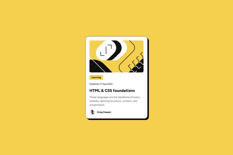


Design comparison

Solution retrospective
I made the blog card responsive to adapt to different screen sizes, ensuring they display correctly on devices with various resolutions.
By the way, I was also thinking of making the hover color a bit darker because I feel like the yellow doesn’t stand out enough, even though it is noticeable.
What challenges did you encounter, and how did you overcome them?While adapting the blog cards for different screen sizes, I encountered challenges related to scaling the elements. To resolve these issues, I used flexible units such as vw, vh, rem, and %, as well as Flexbox for optimal element placement. This allowed me to ensure that the blog cards display well on various devices.
What specific areas of your project would you like help with?I’d love to get some advice on how to make those blog cards even more responsive across different devices, especially when it comes to aligning elements on any screen size. Also, I’d appreciate some pro tips for code optimization and boosting the site's performance — gotta make it run as smooth as butter!
Community feedback
- P@StroudyPosted 7 months ago
Hey, fantastic effort on this! You’re really nailing it. Just a few things I noticed that could make it even better…
-
Maby explore downloading the fonts and add them to your CSS with
@font-face, Downloading fonts and using@font-facein CSS is beneficial because it improves performance by reducing external requests, provides better control over font styling, and ensures consistent rendering across different browsers and devices. -
Setting the
widthandheightfor an<img>helps the page load faster and prevents content from jumping around as the image loads. This is good for performance and improves user experience. However, if your image needs to keep a consistent shape (aspect ratio) across different screen sizes, it's better to use the CSSaspect-ratioproperty instead.
You smashed this challenge, Great CSS/HTML, Great job taking the time to learn! Your efforts are paying off, and I hope these insights guide you to even more success. Keep pushing forward, and remember, you’ve got this! Enjoy your coding adventures! 💪
Marked as helpful1@Grimm-NPosted 7 months ago@Stroudy Hi! I just wanted to say thank you! This is really helpful information for me. I used to think, "Why do I need downloaded fonts if I have Google Fonts?" But now I understand. Thank you again! I will update my code and use this in the future too.
1P@StroudyPosted 7 months ago@Grimm-N, No problem, I highly recommend doing code reviews on here and giving feedback, Good thing is you get to see what other people are doing, Stuff you might not even be aware of. That is the beautiful thing about this platform, If everyone participated, We can all learn from one another. 😁
1 -
- P@MikDra1Posted 7 months ago
I encourage you to use this technique to make the card responsive with ease:
.card {
width: 90%;
max-width: 37.5rem;
}
On the smaller screens card will be 90% of the parent (here body), but as soon as the card will be 37.5rem (600px) it will lock with this size.
Also to put the card in the center I advise you to use this code snippet:
.container {
display: grid;
place-items: center;
}
Hope you found this comment helpful 💗💗💗
Good job and keep going 😁😊😉
Marked as helpful1


Please log in to post a comment
Log in with GitHub
Join our Discord community
Join thousands of Frontend Mentor community members taking the challenges, sharing resources, helping each other, and chatting about all things front-end!
Join our Discord