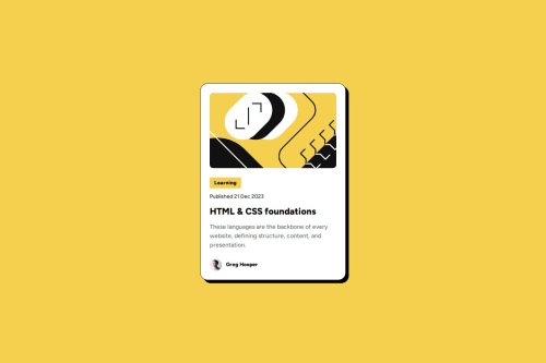
Submitted over 1 year agoA solution to the Blog preview card challenge
Responsive blog preview card using CSS variables and media querry
accessibility, pure-css, semantic-ui

@Jomagene
Solution retrospective
What are you most proud of, and what would you do differently next time?
I'm proud of successfully using CSS variables and media queries to create a responsive blog preview card. Next time, I would focus more on refining the layout for better accessibility and optimizing CSS for performance.
What challenges did you encounter, and how did you overcome them?I encountered challenges in ensuring the card's responsiveness across different devices. I overcame this by leveraging CSS media queries to adjust the layout and sizes dynamically.
What specific areas of your project would you like help with?I would appreciate feedback on:
- Further improving the responsiveness of the card component.
- Optimizing the use of CSS variables for better performance.
- Enhancing the overall accessibility of the design.
Code
Loading...
Please log in to post a comment
Log in with GitHubCommunity feedback
No feedback yet. Be the first to give feedback on MAGENE Sem Joel's solution.
Join our Discord community
Join thousands of Frontend Mentor community members taking the challenges, sharing resources, helping each other, and chatting about all things front-end!
Join our Discord