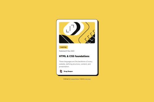
Responsive Blog Preview Card using CSS flex

Solution retrospective
I am most proud of my ability to make this blog preview card responsive on different screen sizes using the CSS media queries. Next time, I plan to use more CSS combinators than individual classes.
What challenges did you encounter, and how did you overcome them?I initially designed for desktop first so I had little issues transforming the card to a mobile friendly version. To solve this, I changed the main CSS rules to address a mobile device first then added a media query for larger screens like tablets and desktops. I also utilized dynamic sizing of the card.
What specific areas of your project would you like help with?I do love an honest feedback of the quality/structure of my codes (both HTML & CSS). Does the HTML elements used tell the true meaning of the content? Does the CSS naming adopted follow best practices and help others easily understand the code?
Please log in to post a comment
Log in with GitHubCommunity feedback
No feedback yet. Be the first to give feedback on Iyare Usen's solution.
Join our Discord community
Join thousands of Frontend Mentor community members taking the challenges, sharing resources, helping each other, and chatting about all things front-end!
Join our Discord