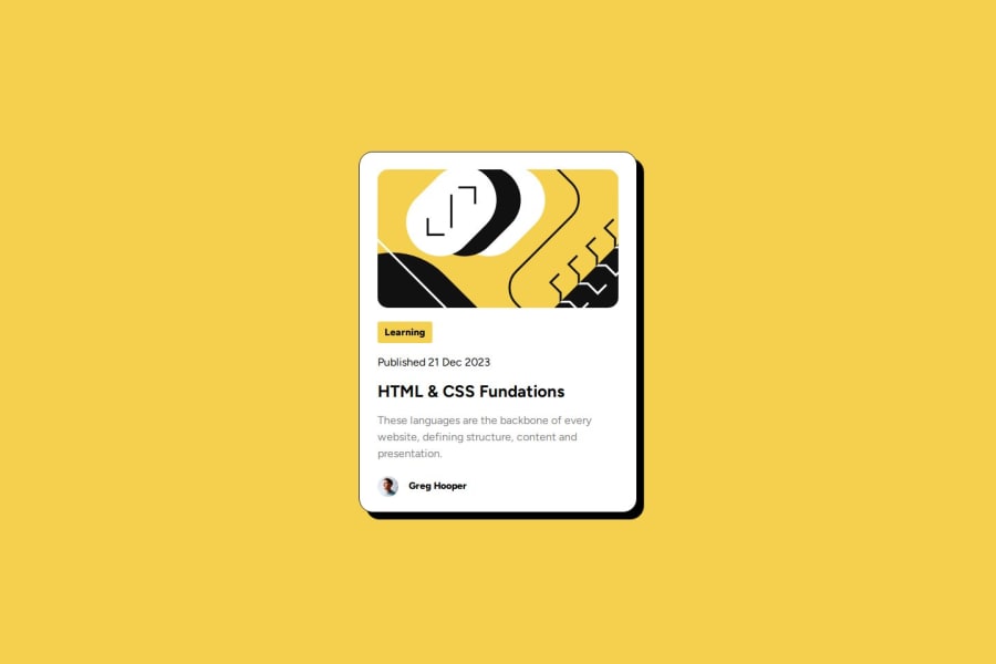
Responsive Blog preview card using CSS and HTML
Design comparison
Solution retrospective
I'm proud of myself, and I know that I can with more Challenges
What challenges did you encounter, and how did you overcome them?Only I have problems with the image in the height
What specific areas of your project would you like help with?At this time, none
Community feedback
- @alb3rt-devPosted about 1 year ago
Great job on the challenge, Donovan!
I have a couple of recommendations that could be useful for your future projects:
-
I highly consider adding the
maintag to the HTML code of your project. This will identify your project's main content - which in this case, is the content inside the card. -
When adding alt text to an image, make sure that it is as descriptive and as accurate as possible. This helps users who are unable to see the image to understand what the image is about.
I hope you find these helpful. Keep up the good work!
1 -
Please log in to post a comment
Log in with GitHubJoin our Discord community
Join thousands of Frontend Mentor community members taking the challenges, sharing resources, helping each other, and chatting about all things front-end!
Join our Discord
