Submitted 6 months ago
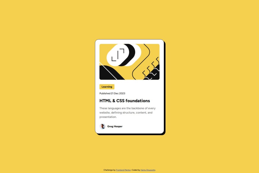
Responsive Blog Preview Card with Mobile-first Workflow
#bem#semantic-ui

P
@hartashu

Design comparison
SolutionDesign

Solution retrospective
What are you most proud of, and what would you do differently next time?
I am introduced with BEM naming convention and semantic HTML, and gradually implement them and try to get used to them.
What challenges did you encounter, and how did you overcome them?Challenge I encountered is to make the text responsive without using media query. So far, what I am thinking of is using relative unit like em or vw.
What specific areas of your project would you like help with?Specific to this project: Without using media query, what is the best practice to set the font size between desktop-view and mobile-view? By using vw or is there any other more correct method?
Need to learn more about:
- semantics HTML in depth.
- Make an efficient, modular, maintainable CSS code to work with a team.
Community feedback
- @Mohammed-morsiwalaPosted 6 months ago
It is great way to get skilled.
0

Please log in to post a comment
Log in with GitHub
Join our Discord community
Join thousands of Frontend Mentor community members taking the challenges, sharing resources, helping each other, and chatting about all things front-end!
Join our Discord