Design comparison
Community feedback
- P@isioma-talabiPosted 3 months ago
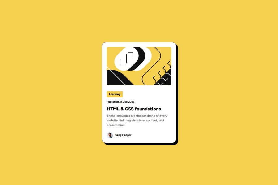
Hallo! Great work. The solution differs a bit from the original design. The font used for the paragraph is of a heavier weight and a different color.
Marked as helpful1 - @StephengrammyPosted 3 months ago
Yoo!! you nailed man like oh my days 😮 i checked your css code and damnnnn it is tight
1 - @ardolynk-rebornPosted 3 months ago
The button doesn't look clickable. IMHO it would be better to add some interaction to the author area as well, then assign
onclickhandlers (some stubs showing alert messages like "Learn more", "Show article", "Show profile"). Styles inside HTML instead of a separate CSS file also look a bit confusing.See my solution for some details.
1@PaiKai-LeePosted 3 months ago@ardolynk-reborn thanks for your feedback. Because this is a small component, so I put together. People can view in one page easily.
0@ardolynk-rebornPosted 3 months ago@PaiKai-Lee I got a comment about "Learn more" items. It could be just a tag, not a button. My apologizes for possible mistake. And yes, great work!
0
Please log in to post a comment
Log in with GitHubJoin our Discord community
Join thousands of Frontend Mentor community members taking the challenges, sharing resources, helping each other, and chatting about all things front-end!
Join our Discord
