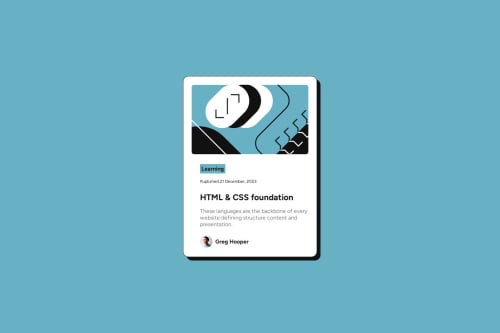
Submitted over 1 year agoA solution to the Blog preview card challenge
Responsive Blog Preview Card
accessibility
@hebaahmedsaleh

Solution retrospective
What are you most proud of, and what would you do differently next time?
I took notes from previous task in accessibity and I used figma to check css to be pixel perfect.
What challenges did you encounter, and how did you overcome them?..
What specific areas of your project would you like help with?..
Code
Loading...
Please log in to post a comment
Log in with GitHubCommunity feedback
No feedback yet. Be the first to give feedback on Heba Ahmad Saleh's solution.
Join our Discord community
Join thousands of Frontend Mentor community members taking the challenges, sharing resources, helping each other, and chatting about all things front-end!
Join our Discord