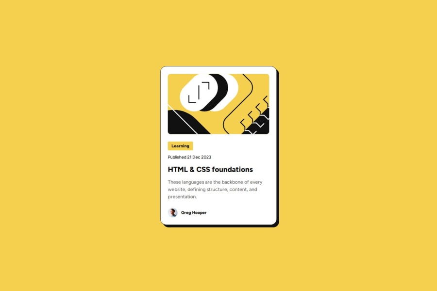
Responsive Blog Preview Card – Modern UI with Flexbox & Accessibility


Design comparison

Solution retrospective
Experience doing more custom styling using custom properties. Studied style scoping when dealing with custom properties. New styling properties and user-action pseudo classes such as :hover and :focus.Additionality, I took the opportunity to learn how to use local fonts (@font-face). For now, I should continue to be comfortable detailing about my css system, so I will be prepared if I go into frameworks on CSS.
The one that boggled me is the hover effect of the card. I used box-sizing: border-box for all elements but somehow adding a filter drop shadow causes the width content to shrink. Well since border-box is the overall width consisting of the content+padding+border, adding a negative margin on hover won't solve it. Instead, a simple fix like using box-shadow is enough. Having fun dealing with CSS!
I am thinking since that the card's behavior has a hover effect triggered by itself. Meaning not its children inside. Wrapping the card to an anchor tag will make the entire view a link. But, it is not recommended as per my research (not semantically appropriate). Is JavaScript the way to do this?
Community feedback
- @hossygiftyPosted 29 days ago
the solution includes semantic tags and it is accessible the code is well structured and readable
0

Please log in to post a comment
Log in with GitHubJoin our Discord community
Join thousands of Frontend Mentor community members taking the challenges, sharing resources, helping each other, and chatting about all things front-end!
Join our Discord