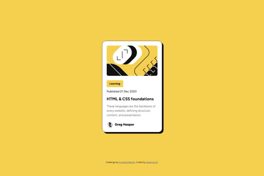


Design comparison

Solution retrospective
I am proud of the result that seems close the original design. I discovered Figma dev mode tool which helped me a lot. It needed some adjustments to be more responsive with percentage instead of fixed padding for the card position. I am also proud of the html structure and how I organized my style files with one file to manage css reset (I grabbed this from a feedback on my previous challenge : very precious, thank you).
What challenges did you encounter, and how did you overcome them?I had hard time with the position of the card to make it centered in both versions mobile and desktop. I've tried first with Figma's elements such as padding but didn't work well, not responsive at all. So I changed for percentages and max-width which seems better.
What specific areas of your project would you like help with?I created a separate css file for the styleguide with variable which sounded like a very good idea. Unfortunately, in my index.css file, I couldn't have the full list of variables, even with @ import the styleguide.css file : I couldn't solve this even after installing css intelissense extension and reboot VS Code, so I opened the styleguide file to copy-paste the needed variables, not efficient at all : any tip on this would be much appreciated. I also had some difficulties with the .title (HTLM&CSS foundations text) in mobile version to make it wrap and I discovered the white-spacing : nowrap. It works, combined with font-size but I am not sure it is the best option...
Please log in to post a comment
Log in with GitHubCommunity feedback
- @SheGeeks
Great progress on this challenge Sandrine. I believe you're on the right track and tackling this project with the right mindset.
I was able to copy and paste all of the variables from the style-guide stylesheet into your index.css file right under the @import statements and they worked. I'm not sure what error you might have experienced, but I encourage trying again. Be sure to put them under the @import statements. If it works this time around, you can remove the import statement from the top of your index.css file.
A tip for your future projects, try writing all of your styles in the same document for small projects like this. The reset stylesheet is fine as a separate file, but the styles you create for projects should typically be together in their own stylesheet.
Hope this feedback is helpful. Kudos on the progress and keep going!
Marked as helpful

Join our Discord community
Join thousands of Frontend Mentor community members taking the challenges, sharing resources, helping each other, and chatting about all things front-end!
Join our Discord