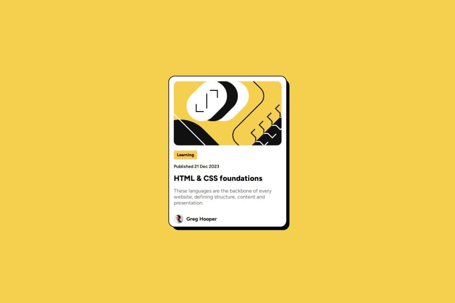
Design comparison
Solution retrospective
Mobile Responsiveness
What challenges did you encounter, and how did you overcome them?Padding and it's responsiveness
What specific areas of your project would you like help with?It there an indication in the design documents that let us know how big the card should be? I'm guessing at the overall size.
Please log in to post a comment
Log in with GitHubCommunity feedback
- @dylan-dot-c
Hey! Well done girl! Everything seems good and alright.
For the size of the card, this is actually a FREE+ challenge that means you get the design(figma) files with it in the folder you downloaded, so you can download figma and inspect the file to see the dimensions of everything.
As for other challenges if you don't have the premium then you would have to try your best to guess them, but I think they use "predictable" values like rem/em and if you use tailwindCSS, they have a disign system that follows the width and spacing values.
Some improvements you can make- The svg in the html code could be used as an image tag with the link to the svg file, instead of having that very long svg code in your html code.
<img src="./assets/images/illustration-article.svg" />One drawback for this is that if you want to change the color of it on an action(required in an junior challenge) say hover you can't do this because it's kinda locked in and wont change for you. - I don't think the learning text is an actual button(tho it could be) but you can leave it as it is, if you think something should happen when a user presses it.
- Don't use fixed width/heights in your code, but more like max/min/width/heights to restrict them to certain values. You should make the content in the element decide the height so it can be fluid and flexible for smaller screens. You can put a
max-widthof 375px on your cardwrapper. - you can use
:root{}in css to declare custom variables that help you build more DRY code and allows ease of flexibility and updating colors in the future. Other than that, you should be good so take care.
- The svg in the html code could be used as an image tag with the link to the svg file, instead of having that very long svg code in your html code.
Join our Discord community
Join thousands of Frontend Mentor community members taking the challenges, sharing resources, helping each other, and chatting about all things front-end!
Join our Discord
