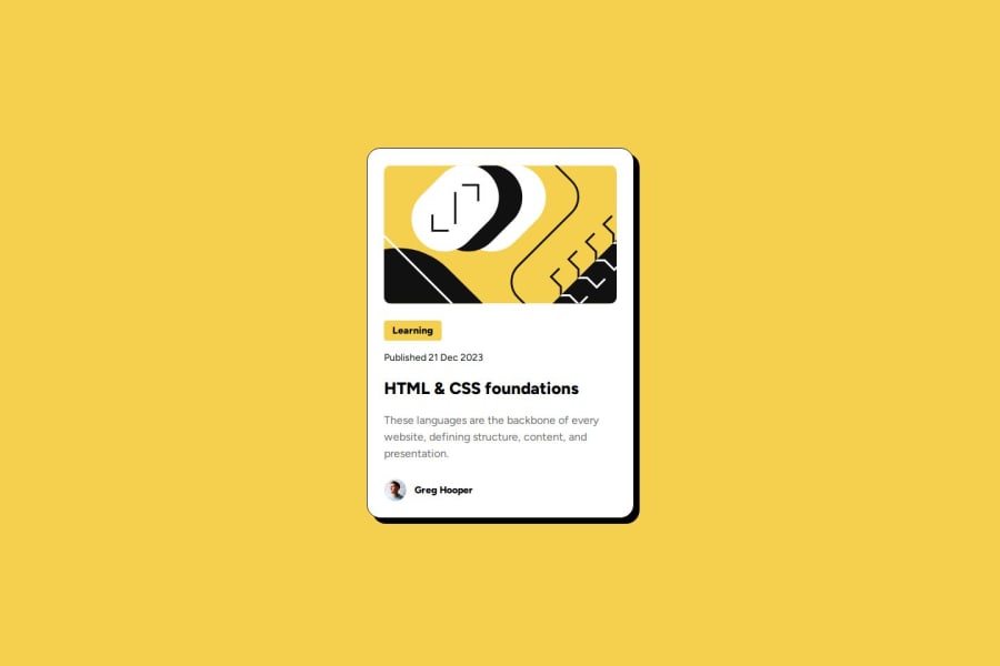
Design comparison
Solution retrospective
I feel like I did a good job making it responsive to all screen sizes. For now, I wouldn't do anything different unless someone suggests an improvement
What challenges did you encounter, and how did you overcome them?I noticed that I made everything responsive except font size. I noticed the little detail that font size changes according to different screen sizes so I addressed this problem with Media Queries.
What specific areas of your project would you like help with?Please tell me if I could improve my HTML/CSS to make it more concise/readable
Community feedback
- @oMarcelosantosPosted 6 months ago
Como iniciante eu gostei muito do formato do seu código, entretanto, achei o arquivo README.md muito confuso.
0
Please log in to post a comment
Log in with GitHubJoin our Discord community
Join thousands of Frontend Mentor community members taking the challenges, sharing resources, helping each other, and chatting about all things front-end!
Join our Discord
