Submitted 12 months ago
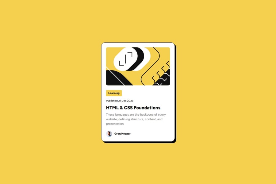
Responsive Blog Preview Card (HTML,CSS)
#accessibility
P
@hichamweblog
Design comparison
SolutionDesign
Solution retrospective
What are you most proud of, and what would you do differently next time?
Hello community, please take a moment to check out this project!
What challenges did you encounter, and how did you overcome them?- I faced a challenge while attempting to implement the inclusive technique described in this article, so I referred to Tediko's solution for guidance.
Your feedback and support are greatly appreciated.
Community feedback
Please log in to post a comment
Log in with GitHubJoin our Discord community
Join thousands of Frontend Mentor community members taking the challenges, sharing resources, helping each other, and chatting about all things front-end!
Join our Discord
