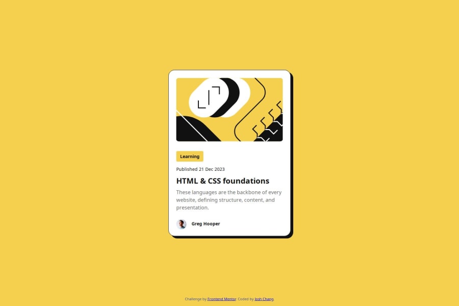
Design comparison
Solution retrospective
- Figma tools
Compared to the previous project, "QR Code Component," this time I incorporated the Figma file into my entire workflow. It’s much more efficient to apply margins and padding directly.
- Cursor syle
It’s my first time customizing the cursor style on hover, and it’s exciting to see how many styles there are to choose from!
.content-main:hover {
    color: #F4D04E;
    cursor: pointer;
}
At first, I was puzzled by the card’s positioning—it just wouldn’t align both vertically and horizontally. After some searching and trial-and-error, I realized it was because I hadn’t set position: absolute on the card.
Although I completed this project, I still find my code a bit lengthy and challenging to maintain. I’d be thrilled if anyone has suggestions on how to improve it!
Community feedback
Please log in to post a comment
Log in with GitHubJoin our Discord community
Join thousands of Frontend Mentor community members taking the challenges, sharing resources, helping each other, and chatting about all things front-end!
Join our Discord
