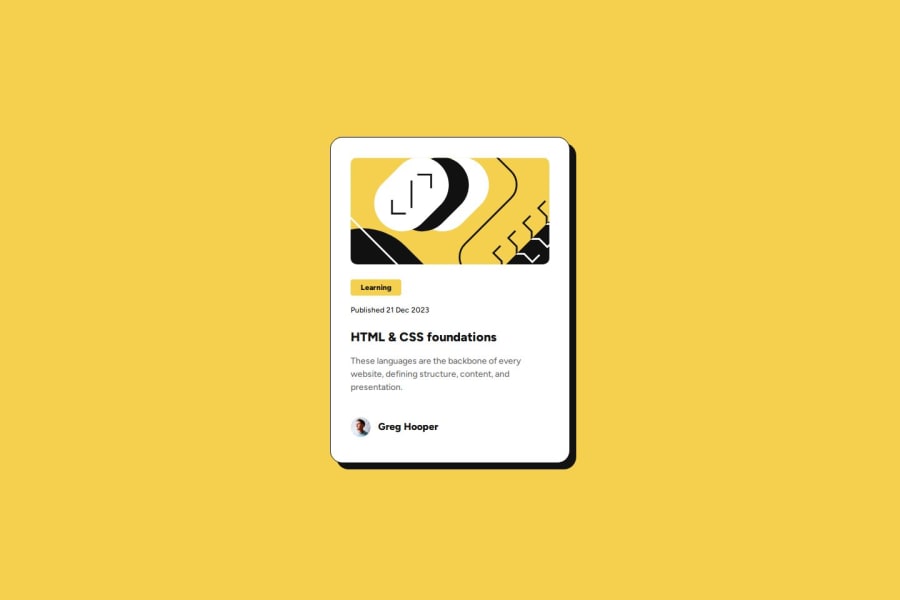
Responsive Blog Preview Card. HTML | CSS Flexbox & Mobile-First Design


Design comparison

Solution retrospective
This project helped reinforce my understanding of Flexbox for layout structuring. I also improved my knowledge of CSS properties like box-shadow. I’m fairly confident in the overall implementation, but I’d appreciate feedback on best practices for responsiveness, particularly if there are more efficient ways to handle spacing and font scaling across different screen sizes.
What challenges did you encounter, and how did you overcome them?Image Placement & Sizing. Challenge: The illustration image wasn’t aligning correctly inside the card. Solution: I Used background-size: cover; background-position: center; to properly position the image while maintaining aspect ratio.
Community feedback
- @Rajsinghh2907Posted 19 days ago
Your solution demonstrates a solid structure with semantic HTML, but improving accessibility with proper ARIA attributes and alt text for images would enhance usability. Additionally, ensure the layout remains fully responsive across different screen sizes for a better user experience.
0

Please log in to post a comment
Log in with GitHub
Join our Discord community
Join thousands of Frontend Mentor community members taking the challenges, sharing resources, helping each other, and chatting about all things front-end!
Join our Discord