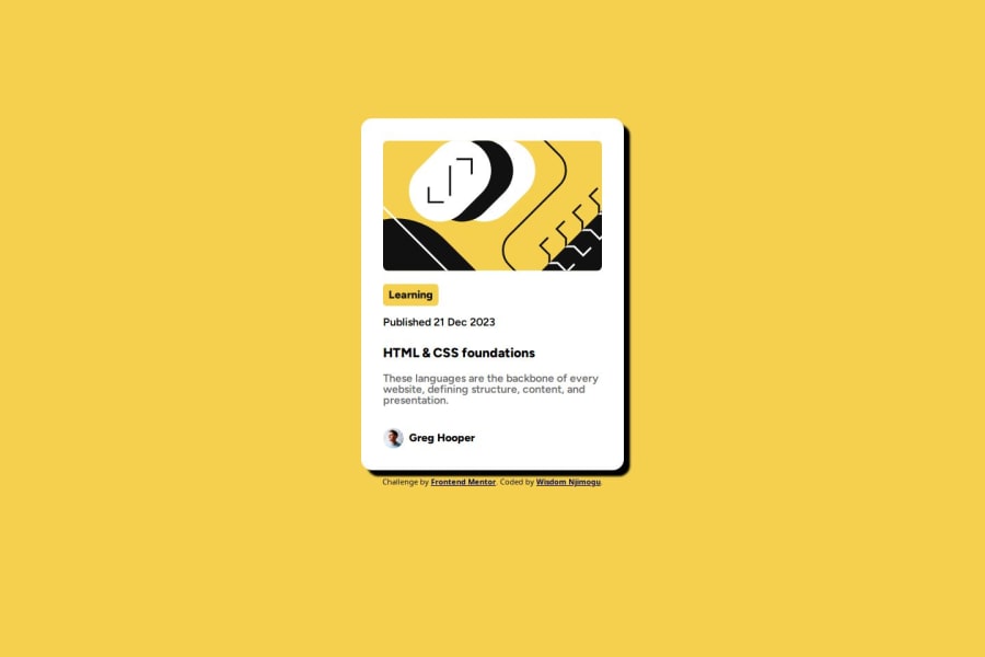


Design comparison
SolutionDesign

Community feedback
- @AlvaroPratesPosted 8 months ago
Good work, keep on practicing!
Let's go over some point that I observed from the screenshot:
- I think the card component would look better if centralized in the page. You could achieve that by wrapping the card in a
<main>or<section>tags and setdisplay: flex;and addalign-items: center;andjustify-content: center;. - Need to ajust the card
widthproperty. In the figma files the card's width is384px. To make this adjustment easier, you can setbox-sizing: border-boxin a universal CSS selector. - In the design there is a little thin black border around the card. You can add all the properties in the
borderproperty. - Need to adjust the spacing between elements in the card information. I think the easiest way to achieve different spacing is with the
margin-bottomproperty. - Probably should add a little more padding to the card, but I'm just being picky...
Marked as helpful0@Hart-wizPosted 8 months ago@AlvaroPrates thanks alot sir, this was very helpful....implemented the border-sizing: border-box and width. came out so well, wow ....much appreciated, still implementing other changes.
0 - I think the card component would look better if centralized in the page. You could achieve that by wrapping the card in a

Please log in to post a comment
Log in with GitHub
Join our Discord community
Join thousands of Frontend Mentor community members taking the challenges, sharing resources, helping each other, and chatting about all things front-end!
Join our Discord