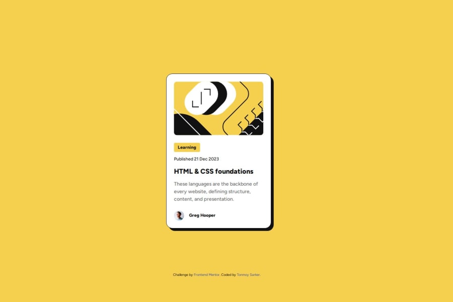


Design comparison

Solution retrospective
I liked how it turned out. I had fun.
What challenges did you encounter, and how did you overcome them?Initially I was confused about given font files and looked through how to use downloaded fonts. But, then I just imported the font from google fonts.
I also learned how to set font-size in a range.
What specific areas of your project would you like help with?None for this one.
Community feedback
- @dayu420Posted 2 months ago
Things to look at:
- If the blog cover photo is purely decorative (i.e., it doesn’t add meaningful content or context to the blog post), it’s better to set the alt attribute to an empty string (alt=""). This ensures that screen readers skip the image, avoiding unnecessary distractions for users relying on assistive technologies.
-
It's generally not recommended to place an <h3> element before an <h2> element in your HTML structure. Heading elements in HTML should follow a hierarchical order to maintain both semantic meaning and accessibility.
-<h1> (typically used for the main page title)
-<h2> (used for major sections or subsections)
-<h3> (used for subsections under <h2>)
-<h4>, <h5>, and <h6> (for deeper levels of sub-sections)
- It's better to use a proper CSS reset rather than just applying ( {})* to ensure consistent styling across all browsers and avoid potential issues with default styles. Andy Bell have a good one. You can search it on internet.
- I noticed you're using the position property to control the layout within your flexbox structure. While this works, it's not necessary when you're using Flexbox. Instead of relying on position: absolute or similar properties, you can simplify the layout by wrapping the entire content in a .wrapper or just adding class .wrapper to main tag element and setting it to display: flex with flex-direction: column. This allows the elements to naturally flow and adjust.
Here’s a more efficient approach:
1.Wrap the content: Put everything inside a .wrapper element.
css
.wrapper {
    display: flex;
    flex-direction: column;
    height: 100%; /* Ensure it takes up the full available height */
}
2.First Child (Main Content): Set flex-grow: 1 on the first child element (usually your main content). This makes it expand to take up all the available space.
css
.wrapper > .main-content {
    flex-grow: 1;
}
3.Footer: For the footer, use margin-top: auto to push it to the bottom of the wrapper, making sure it only takes up as much space as needed.
css
.wrapper > .footer {
    margin-top: auto;
}
With this structure:
The blog-preview-card element grows to fill all available space, while the footer will remain at the bottom, taking up only the space it needs. No need for position: absolute or position: relative when you're working with Flexbox; this method is cleaner and more maintainable.
- The calc() expression you're using (100vw - 375px) might be unnecessarily complex unless you're targeting a very specific range of devices. clamp() itself is already a powerful tool, and adding calc() may add extra complexity that’s harder to maintain in the long term.
You could achieve similar results by simply using clamp() with a percentage or viewport width without the need for a custom calc() calculation.
Marked as helpful0@tonmoysarkerPosted 2 months ago@dayu420 Thank you very much!!! This feedback is very helpful to me.
- I learned about the decorative image alt that you mentioned after reading your feedback, I had never heard about that before.
- I was also always confused about putting "h" tags. That point cleared it for me.
- I am not much aware of "css resets" and since it was a simple project, I just did it manually. And, I also thought unless necessary css resets would just clatter the css file. However, since I am still learning, I will absolutely look into it.
- The feedback about the position sort of opened my eye, it seems I was looking at the card mostly and considered the footer to be a baggage and handled it simply. I should've looked at the whole project together and as you said could wrapped everything and used flex. Thanks for that especially.
- I didn't understand the calc() and clamp() talk, I am kinda getting back to programming after a long time, so still catching up on functions. I will definitely look into it.
0

Please log in to post a comment
Log in with GitHub
Join our Discord community
Join thousands of Frontend Mentor community members taking the challenges, sharing resources, helping each other, and chatting about all things front-end!
Join our Discord