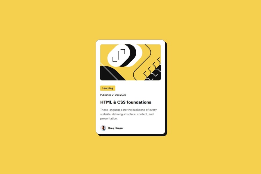
Design comparison
SolutionDesign
Solution retrospective
What are you most proud of, and what would you do differently next time?
I am happy with my CSS implementation with the mobile-first workflow, as long as I continue with this workflow I will be better.
What challenges did you encounter, and how did you overcome them?I learned how to implement a variable font and how to use clamp function on CSS for responsive fonts. Also I remembered how it works the box-sizing property. I could resolved reading the documentation.
Community feedback
- @loicduongPosted about 1 month ago
It looks like the box-shadow size doesn't match the design
0
Please log in to post a comment
Log in with GitHubJoin our Discord community
Join thousands of Frontend Mentor community members taking the challenges, sharing resources, helping each other, and chatting about all things front-end!
Join our Discord
