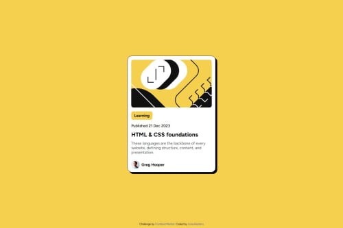
Submitted about 1 year agoA solution to the Blog preview card challenge
Responsive Blog Preview card
@IrineuRastero

Solution retrospective
What are you most proud of, and what would you do differently next time?
Less difficulty centralizing and working partially with rem.
What challenges did you encounter, and how did you overcome them?I didn't start with mobile and had some difficulties trying to make the page responsive without media queries, changing the sizes to rem solved a big part of the issues
What specific areas of your project would you like help with?I frequently have path problems that only appear after I upload to Github, Is there any extensions for VS Code that allow you to see how the Github deployment will look like?
Code
Loading...
Please log in to post a comment
Log in with GitHubCommunity feedback
No feedback yet. Be the first to give feedback on Gustavo Dantas's solution.
Join our Discord community
Join thousands of Frontend Mentor community members taking the challenges, sharing resources, helping each other, and chatting about all things front-end!
Join our Discord