Design comparison
Community feedback
- @PavlaBerankovaPosted 4 months ago
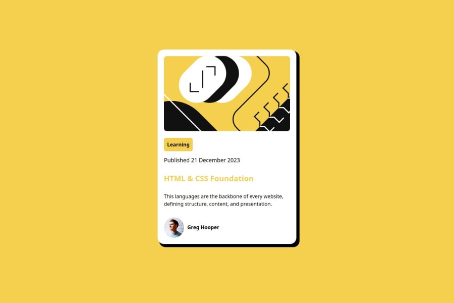
Code is well-structured and readable for me. Do not include semantic HTML. You use different font and color for text.
0 - @HamedSamavatiPosted 4 months ago
#In total is identical, however there are some differences: header is yellow, it must be black though. while hovering must turn to yellow. missing border line. wrong color for info.
recommendations: -using meaningful names for classes. -dividing elements in landmarks like main , header, footer, aside, .. -attention to details and sizes. -using a separate style file helps to save more time. -doing hover practices on different elements.
0
Please log in to post a comment
Log in with GitHubJoin our Discord community
Join thousands of Frontend Mentor community members taking the challenges, sharing resources, helping each other, and chatting about all things front-end!
Join our Discord
