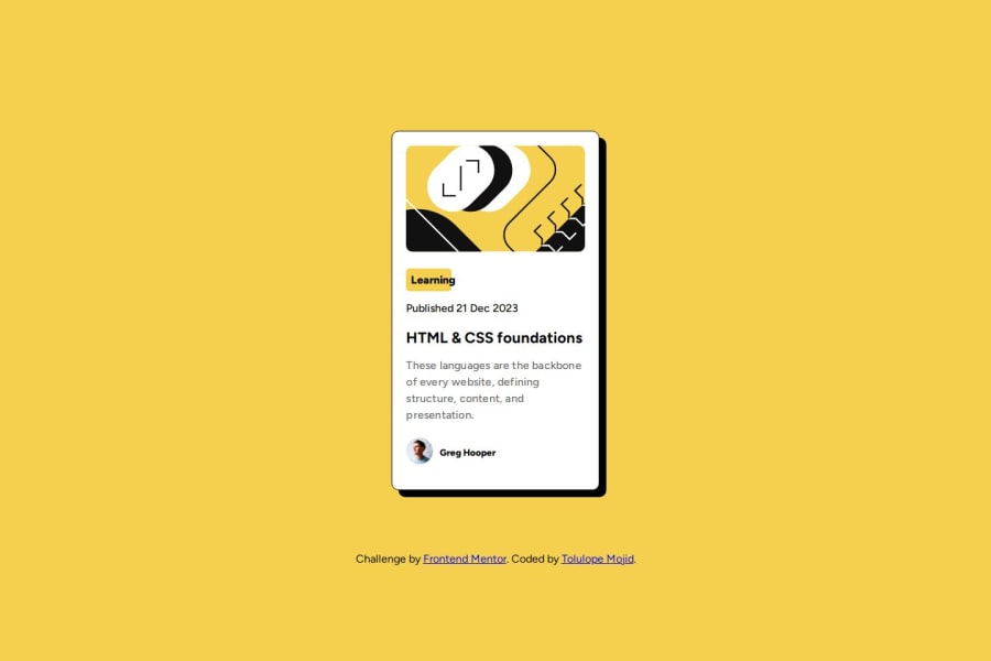


Design comparison

Solution retrospective
I'm most proud of this project mainly because I did not check any tutorial to solve any of the problem. I just used past knowledge and checked for new css rules I haven't used before in documentation.
What challenges did you encounter, and how did you overcome them?I encountered an issue with putting an image and text on the same line. I ended up using Flexbox to overcome this issue.
What specific areas of your project would you like help with?I'm pretty happy with the result on this project.
Community feedback
- @andreshinostrozaPosted about 1 month ago
you can add a specific width to the card and add a class to the main image. .card { padding: 23px; max-width: 336px; } .image-card { max-width: 100%; width: 336px; } With that I think the image could be centered
0 - @jonbeluvPosted about 1 month ago
it was a very good challenge it made me focus more on choosing the right padding and the importance of line-height, choosing the right HTML tags and can i met you
0 - @mrprogrammer1-2Posted about 1 month ago
it was a very good challenge it made me focus more on choosing the right padding and the importance of line-height, choosing the right HTML tags
0


Please log in to post a comment
Log in with GitHub
Join our Discord community
Join thousands of Frontend Mentor community members taking the challenges, sharing resources, helping each other, and chatting about all things front-end!
Join our Discord