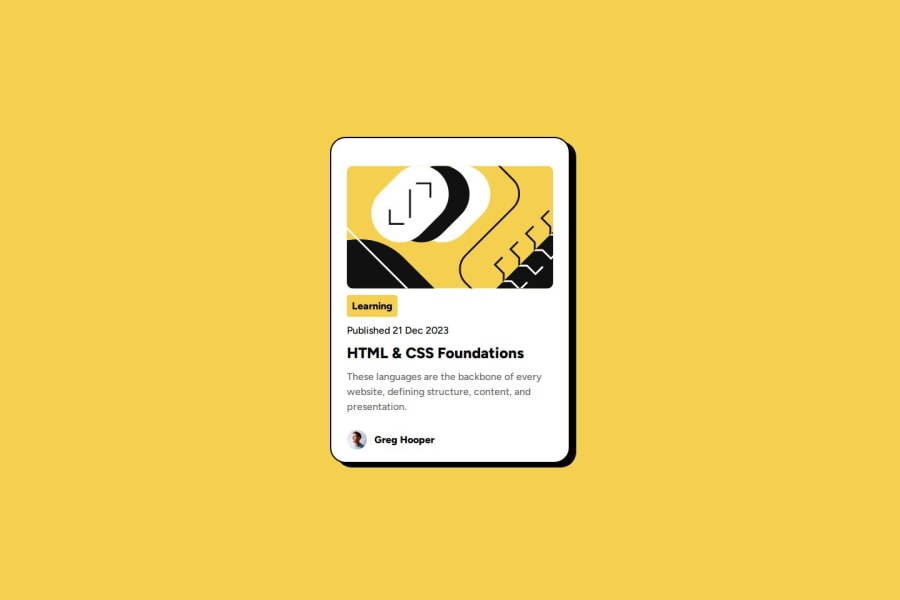
Design comparison
SolutionDesign
Solution retrospective
What are you most proud of, and what would you do differently next time?
I managed to do this one compared to my first one in quite literally half the time - it took me an hour overall
What challenges did you encounter, and how did you overcome them?The positioning was slightly weirder with having a main tag but I managed to understand flex containers and items more precisely.
What specific areas of your project would you like help with?I want to understand if my design is considered responsive when changing the device size to match the one in the Figma file for mobile view.
Please log in to post a comment
Log in with GitHubCommunity feedback
- @edwincaipa
good job
- @Relanaria
All good
Join our Discord community
Join thousands of Frontend Mentor community members taking the challenges, sharing resources, helping each other, and chatting about all things front-end!
Join our Discord
