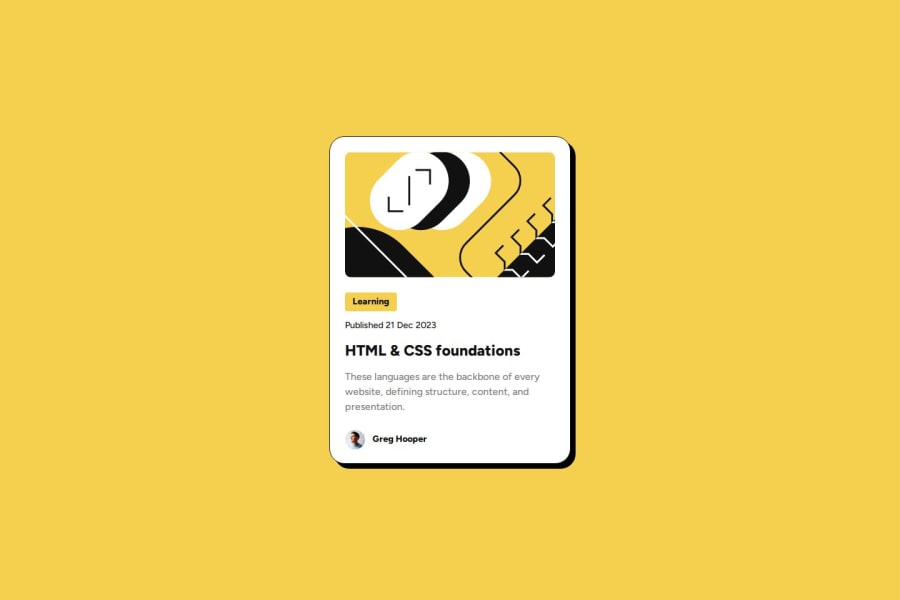
Design comparison
SolutionDesign
Solution retrospective
What are you most proud of, and what would you do differently next time?
I am proud to achieve the closest design as possible, also I have applied a animation when the user hover the card.
What challenges did you encounter, and how did you overcome them?Definitely the border style, I don't think I could match it without extracting the figma css code for it.
What specific areas of your project would you like help with?I would like help with the semantic HTML
- I have used a
h2in the article topic, which comes before theh1, my main question is if it have impacts in accessibility. - Is correct to have a header with only a image and have the
h2andh1in amainelement.
Community feedback
Please log in to post a comment
Log in with GitHubJoin our Discord community
Join thousands of Frontend Mentor community members taking the challenges, sharing resources, helping each other, and chatting about all things front-end!
Join our Discord
