

Design comparison

Solution retrospective
I learned how to properly center a flexbox in the center of the screen, something that I have struggled with for a while now. I learned how to better space items out, by using dev tools. Next time I would probably change the way that I approached this, by not being hard on myself and to know it's ok to consult the documentation.
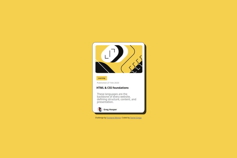
What challenges did you encounter, and how did you overcome them?I was really hard on myself because I couldn't center the card. It turned out, I just needed to sort out the height. But it took about 4 days of stressing to realise, after reading articles it helped.
What specific areas of your project would you like help with?Have I done the media query correctly? I was thinking only one could be needed.
Community feedback
- @BlackpachamamePosted 19 days ago
Greetings! you have done a great job 😎
📌 Some suggestions
- I recommend using
box-sizing: border-boxin your universal selector*so that it applies to all elements and not just thebody - Add a
paddingto generate interior space on your card. This prevents you from usingmarginorpaddingon child elements to achieve the same result - Use
min-heightandmax-width, this will help the content stretch or shrink if you need to. Unlikeheightandwidthwhich can cause your content to be cut off on certain screens. For example, usemin-height: 100vhinstead ofheight: 100vh
Marked as helpful1 - I recommend using


Please log in to post a comment
Log in with GitHubJoin our Discord community
Join thousands of Frontend Mentor community members taking the challenges, sharing resources, helping each other, and chatting about all things front-end!
Join our Discord