Not Found
Not Found
Not Found
Not Found
Not Found
Not Found
Not Found
Not Found
Not Found
Not Found
Not Found
Not Found
Not Found
Not Found
Not Found
Not Found
Not Found
Not Found
Not Found
Not Found

Submitted

Responsive Blog Preview Card

@thaArcadeGuy

Desktop design screenshot for the Blog preview card coding challenge

This is a solution for...

  • HTML
  • CSS
1newbie
View challenge

Design comparison


SolutionDesign

Solution retrospective


What are you most proud of, and what would you do differently next time?

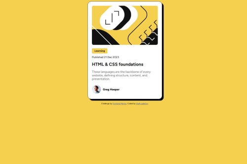
I struggled with fitting the Illustration in its div container but after I figured it out I was proud of myself. I didn't use the provided local fonts so I think next time I will need to try and learn how to use locally hosted fonts.

What challenges did you encounter, and how did you overcome them?

For starters fitting the the illustration without cropping and leaving whitespaces on the left and right sides but after doing some google searches and try and error I finally did figure it out.

What specific areas of your project would you like help with?

I need to learn how I can structures my CSS properly so any feedback on it will be highly appreciated.

Community feedback

Hale 330

@halelite

Posted

hi @thaArcadeGuy

Good job! Your solution looks great!

I just noticed a small thing about your CSS. In the design, the component is centered both horizontally and vertically. I suggest you center your component vertically as well, so your project looks way much better. There are a lot of ways to center it. Some of them are:

  • using flexbox

  • using margin or padding

  • using absolute position property

position: absolute
top: 50%;
transform: translateY(-50%);

Other that that great job! 👍

I hope it helps!

Marked as helpful

0

@thaArcadeGuy

Posted

@halelite Thank you very much. Let me get to it.

This is what I have used.

body {
    position: relative;
    height: 100vh;
}

.main-card {
    position: absolute;
    top: 50%;
    left: 50%;
    transform: translate(-50%, -50%);
}
0

@meghaspatil1

Posted

hello, I think you should focus on the box model; it is not set to criteria, and the below author name needs to be removed. Instead of a button for the "Learning section," you would have used hover; it would have been more responsive, set as a challenge given.

0

@thaArcadeGuy

Posted

@meghaspatil1 Thanks for your feedback. I don't get what you mean especially with this "Instead of a button for the "Learning section," you would have used hover; it would have been more responsive, set as a challenge given." So if you can clarify more it will be much appreciated. Thank you.

0

Please log in to post a comment

Log in with GitHub
Discord logo

Join our Discord community

Join thousands of Frontend Mentor community members taking the challenges, sharing resources, helping each other, and chatting about all things front-end!

Join our Discord