Design comparison
Solution retrospective
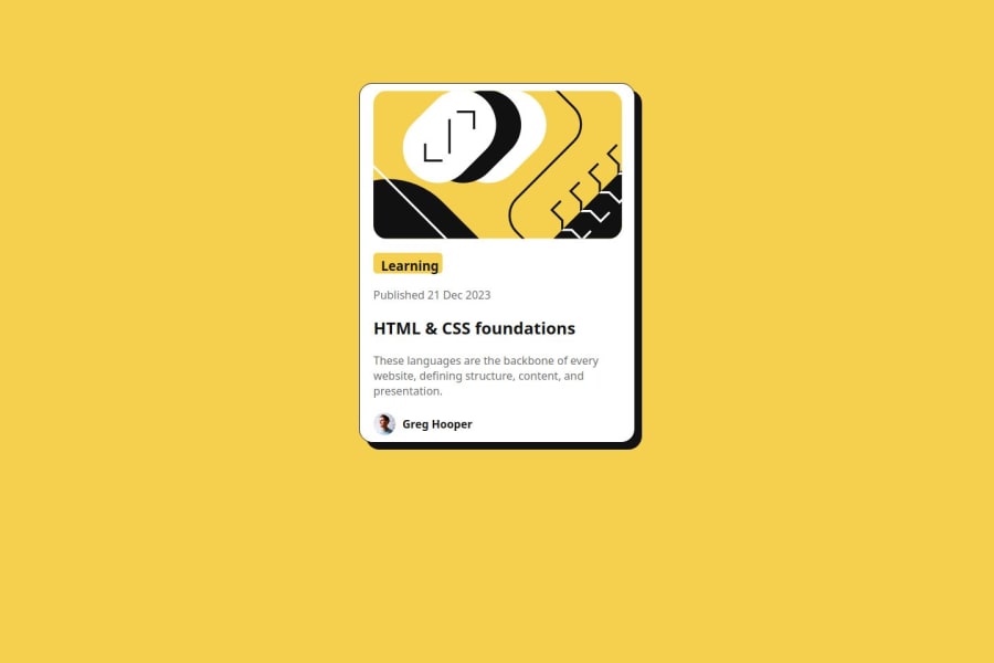
I center the page through margin-auto and next i will be using variables.
What challenges did you encounter, and how did you overcome them?I encounter some difficulties will trying to center the image but thanks to my mentor (Abdullahi) he help me out.
What specific areas of your project would you like help with?Am just starting to learn HTML and CSS so am lacking alot in everything so i need your help, feel free to correct me THANKS.
Community feedback
- @Grimm-NPosted 5 days ago
First off, great job! 🎉 Your attention to detail really shows, and your layout is coming along nicely. Keep up the good work! 👏
A few tips to polish things even further:
-
Use Relative Units Instead of
px
: To make your design more responsive, try using units likeem
,rem
,%
,vw
, orvh
instead of pixels. Relative units allow your layout to adapt more flexibly to different screen sizes and user settings, making the experience smoother on various devices. 📱➡️💻 -
Use Flexbox for Alignment in Containers: When centering content within a container (like the
body
),flexbox
is often a better choice than setting largemargin
values. Flexbox gives you more control, especially for aligning elements both horizontally and vertically. Here’s an example of how to center content in thebody
:body { display: flex; align-items: center; /* Centers vertically */ justify-content: center; /* Centers horizontally */ min-height: 100vh; /* Ensures full viewport height */ }
This setup keeps everything centered beautifully with less code and better responsiveness.
-
Set Card Width to 90% or 90vw for Small Screens: Noticed on smaller screens that the card sometimes sticks to the edges or even overflows the viewport. Setting the card width to something like
90%
or90vw
will prevent this, as the card will shrink to fit within the screen’s width. This approach gives your content breathing room on smaller devices and helps avoid overflow issues. 😊 -
Use a CSS Reset: Styling resets like A (more) Modern CSS Reset by Andy Bell are life-savers. 🧹 They clear out default browser styling so you start with a clean slate, ensuring a consistent look across all browsers. Without a reset, different browsers might interpret default styles differently, leading to unexpected (and sometimes frustrating!) layout shifts. Let’s keep it neat and predictable! 👍
These tweaks will give your layout even more polish and make it shine on any screen size. Great job, and keep up the fantastic work! 🎨✨
Marked as helpful2@Grimm-NPosted 3 days ago@Adamul-asfa It’s all good; that’s the beauty of this platform! We learn from each other’s code and share tips—that way, we learn faster.
0 -
Please log in to post a comment
Log in with GitHubJoin our Discord community
Join thousands of Frontend Mentor community members taking the challenges, sharing resources, helping each other, and chatting about all things front-end!
Join our Discord