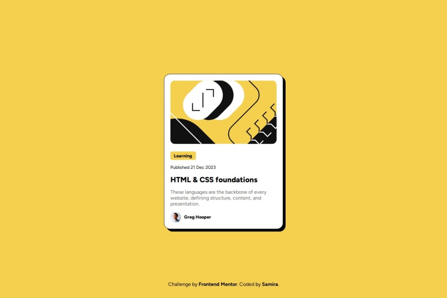


Design comparison

Solution retrospective
I am proud that I'm improving my time in completing these challenges.
What specific areas of your project would you like help with?I would like some feedback about responsive. Is there another way to handle the breakpoints instead of media queries? I made sure to handle the 375px and some other that I considered that were distorting the content, but I would have liked to manage the text positioning better.
Community feedback
- @hannibal1631Posted about 2 months ago
Well, if you're talking about adjusting between mobile and desktop screen. Sadly with vanilla css, there's no way to avoid media queries. You have to give some properties to make it responsive. One way you can minimize that is to use the global/desktop properties carefully because most of the carry forwards.
The only way you can handle the responsiveness without thinking about media queries is to use TailwindCSS. For simple projects like these ofc, cause for big pages even there you have to use media queries. But in tailwind it's already mobile first. Hope this helps.
Let me know if you would like to connect. Happy Coding!!!
Marked as helpful0@gely25Posted about 2 months ago@hannibal1631 Thanks a lot. I really appreciate your feedback!. I’ll make sure to take your suggestions into account in order to improve.
1@hannibal1631Posted about 2 months ago@gely25 glad it helped. Let me know if you'd like to connect.
0

Please log in to post a comment
Log in with GitHub
Join our Discord community
Join thousands of Frontend Mentor community members taking the challenges, sharing resources, helping each other, and chatting about all things front-end!
Join our Discord