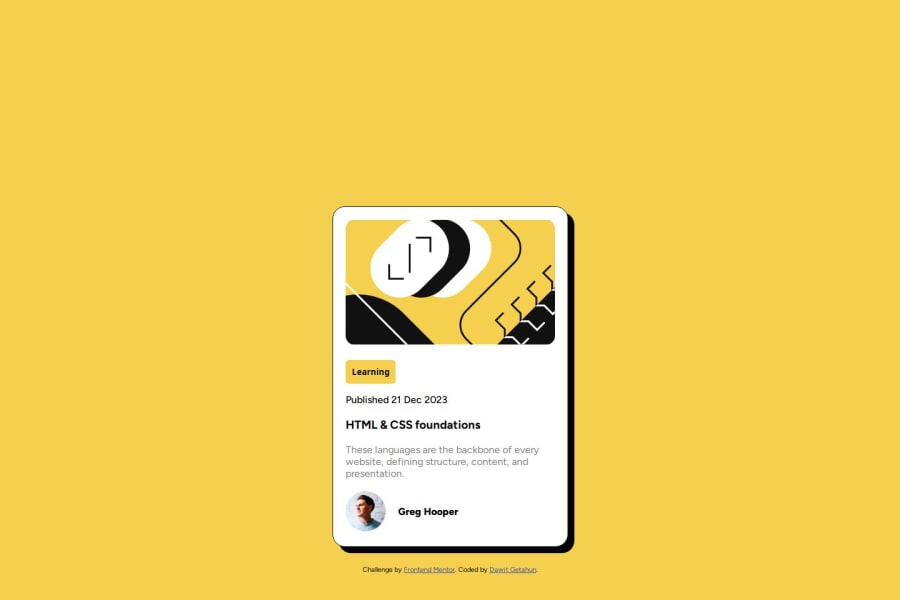
Design comparison
SolutionDesign
Solution retrospective
What are you most proud of, and what would you do differently next time?
Completing the blog preview card project from Frontend Mentor was a proud achievement. I applied my HTML and CSS skills to create a responsive and visually appealing card, overcoming challenges and gaining valuable experience in front-end development. This project showcased my dedication to learning and improving as a developer.
What challenges did you encounter, and how did you overcome them?During the blog preview card project, I faced several challenges:
Positioning Elements: Ensuring that elements within the card were correctly positioned and aligned across different screen sizes posed a challenge. I overcame this by using CSS Flexbox to create a responsive layout that adjusted seamlessly to various devices.

Styling Consistency: Maintaining consistent styling, such as typography and color schemes, required attention to detail. I addressed this challenge by creating reusable CSS classes and adopting a modular approach to styling, making it easier to maintain consistency throughout the card.
I would like to know how to add 3D effects to my websites. And sometimes its a little bit challenging to position elements. Not getting the expected result after applying a CSS position style.
Community feedback
Please log in to post a comment
Log in with GitHubJoin our Discord community
Join thousands of Frontend Mentor community members taking the challenges, sharing resources, helping each other, and chatting about all things front-end!
Join our Discord
