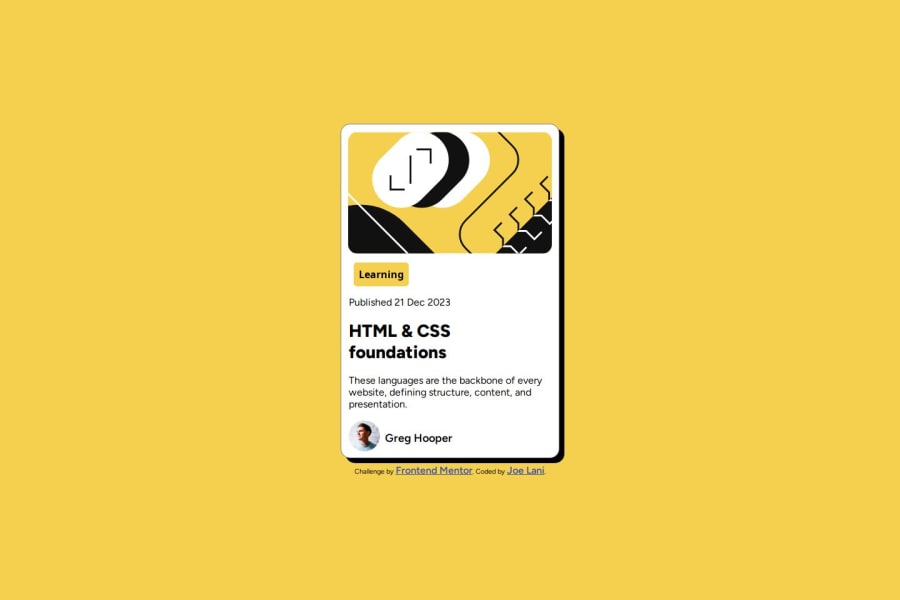
Design comparison
SolutionDesign
Solution retrospective
What are you most proud of, and what would you do differently next time?
This project allowed me to develop strong time management skills and ensure independent completion
What challenges did you encounter, and how did you overcome them?none
What specific areas of your project would you like help with?media queries
Please log in to post a comment
Log in with GitHubCommunity feedback
- @john-mirage
hello, nice work
here are some ways to improve your project
- You can add meta tags for social media so your project in well represented on facebook twitter etc.. metatags
- You can generate favicons for all the devices on this website
- Use html semantic tags to surround your content in the body, it is better for accessibility and SEO (<main> <header> <footer> etc...).
- You can use the BEM methodology for the name of your classes, it helps a lot.
- You should try to use REM instead of px for the sizes, it is better.
The project require some media queries for the texts. You can add them with:
.text {
  font-size: 1rem;
}
@media screen and (min-width: 576px) {
  .text {
    font-size: 1.5rem;
  }
}
The rules defined on the text class will be apply when the screen is 576px of width minimum, so before 576px the text will be 1rem and after 1.5rem.
Marked as helpful
Join our Discord community
Join thousands of Frontend Mentor community members taking the challenges, sharing resources, helping each other, and chatting about all things front-end!
Join our Discord
