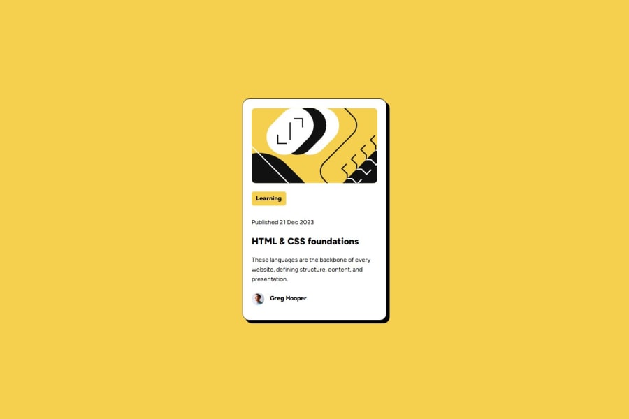
Design comparison
Solution retrospective
I tried to make it responsive as much as possible. Initially struggled to style black border similar to given design but after little bit of research learned more about following property.
- box-shadow
- when and how to use !important
- max-width and max-height
- how to scale image size using transform property.
- vertical-align
Community feedback
- @younes-atyqPosted 3 months ago
Hello @shailesh7333, congrats completing the challenge!
I recommend using a fixed width for your card and employing media queries to adjust its style across different screen sizes. This will significantly enhance your card's visual appeal on various devices.
Avoid using the
!important
declaration as it can lead to style conflicts. Instead, prioritize specificity in your CSS rules. For instance, if the.blog_title
element is overridden by the style in.blog_preview_child p
, create a more specific selector like.blog_preview_child p .blog_title
to target the title within its parent element.Consider replacing generic tags like p with more semantic elements like heading tags (e.g.,
h1
,h2
) orspan
tags for better structure and styling control.Marked as helpful1@geomydasPosted 3 months ago@younes-atyq there is no need for media queries in this project. you dont need to set a fixed with but a fixed max-width
0@younes-atyqPosted 3 months ago@geomydas you're right.
But while using
max-width
you only prevents an element from expanding beyond a certain point on larger screens, it doesn't restrict its size on smaller ones.So if you don't set a fixed width, both
min-width
andmax-width
should be used.0@geomydasPosted 3 months ago@younes-atyq Wdym, you don't need to set a min-width at all. Also, fixed width means the width property is set in fixed units such as px and rem and not in relative units such as vw and %. You can typically do both a width: 100% and max-width: of whatever value. You don't really need to set min-widths most of the time
0@younes-atyqPosted 3 months ago@geomydas idk about that, you can establish a baseline width with the
min-width
for elements, ensuring they don't collapse unexpectedly, and this can be helpfull for maintaining consistent layout structure across different screen sizes, for example, how the text readability is affected when its container shrinks, or the interactive elements like buttons or links need to be large enough to be easily tapped.and still as you said most of the time it's not really needed,but it's essential to consider the specific requirements of your design and content.
0 - @geomydasPosted 3 months ago
I haven't read your code yet but you should never really use important in any circumstance. Just try to keep the speficity as low as possible by using classes instead of ids for styling, avoiding descendant/combinators/child selectors such as >, + or ~ and pseudo-elements/classes such as :not, :has, as much as possible.
Also, you don't really need to scale the image size using transforms. Use width, height and the aspect-ratio properties instead. You would typically use transforms for animations most of the time
Marked as helpful1@shailesh7333Posted 3 months ago@geomydas Thank You! If you get a chance to review the code, please provide more feedback where necessary.
0@geomydasPosted 3 months ago@shailesh7333 I think you should try practicing your BEM more. I also suggest that you shouldn't only use paragraphs but use headings aswell such as
<h1>
. Its quite simple to judge when to use a heading.You should use more semantic html tags aswell, try learning about <main>, <footer>, <section> and <nav> tags. I suggest replacing line 28 with a main tag. What the <main> tag does is it basically says that is the primary or main content of the page that needs the most attention.
For a more general advice, you can organize your files better by making a
/src
folder with your code in (HTML, CSS, JS, whatever) and don't put other things in/assets
folder except for fonts and imagesFor your CSS, I reccomend you use a CSS Reset. Use either the Josh Comeau or Andy Bell one. It makes your CSS look the same no matter what browser the visitor is using. I don't reccomend using the
px
unit for font related properties. See why. You should also learn when to use rem hereMarked as helpful1@shailesh7333Posted 3 months ago@geomydas
Thanks! As a beginner, your suggestions for me are more valuable !
0
Please log in to post a comment
Log in with GitHubJoin our Discord community
Join thousands of Frontend Mentor community members taking the challenges, sharing resources, helping each other, and chatting about all things front-end!
Join our Discord