Submitted 5 months ago
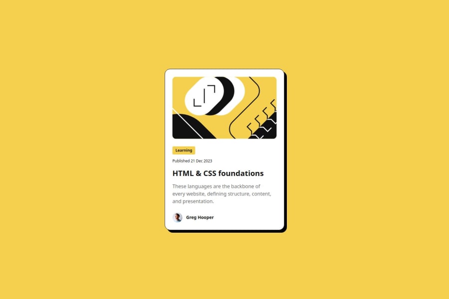
Responsive blog post using HTML,CSS and tailwindcss
@hubertasGeciauskas
Design comparison
SolutionDesign
Solution retrospective
What are you most proud of, and what would you do differently next time?
I'm proud that this time it was easier to read from the Figma designs, which streamlined the development process.
What specific areas of your project would you like help with?I'm looking for feedback on my CSS custom styles. Are they effectively set up for responsive design, or would it be better to implement a mobile-first approach? Any specific suggestions for improvement would be appreciated.
Community feedback
- P@brunagoncalvesPosted 5 months ago
Hello everything is fine!
Analyzing your CSS.
- Adding a CSS reset is generally a good practice as it helps with consistency between browsers. Examples (https://meyerweb.com/eric/tools/css/reset/), (https://www.joshwcomeau.com/css/custom-css-reset/).
- Define variables for colors.
- Instead of setting fixed sizes for the .card's width and height (384px and 522px), use max-width and min-height to allow the element to fit better on different screens. This is especially useful for devices larger and smaller than the specified values.
- Swap px for rem in fonts, using px can limit flexibility and responsiveness. It can change in other classes that have px as well.
- Add a 1rem padding to the body, so that on smaller devices the card does not touch the edge of the screen.
Marked as helpful1
Please log in to post a comment
Log in with GitHubJoin our Discord community
Join thousands of Frontend Mentor community members taking the challenges, sharing resources, helping each other, and chatting about all things front-end!
Join our Discord
