Design comparison
SolutionDesign
Solution retrospective
What are you most proud of, and what would you do differently next time?
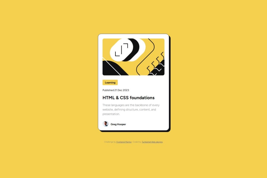
I am proud to have been able to get my solution looking close to the challenge design. Using media query was something that was new to me, but I got it working with little effort. With a little research I was able to get it after a try or two.
What challenges did you encounter, and how did you overcome them?The one challenge I struggled to resolve was having the box-shadow grow on hover. Looking at the design file(.figma) I noticed the shadow grew on hover. I was not sure how to implement this.
What specific areas of your project would you like help with?I would like some direction on hover actions and how to implement them.
Community feedback
Please log in to post a comment
Log in with GitHubJoin our Discord community
Join thousands of Frontend Mentor community members taking the challenges, sharing resources, helping each other, and chatting about all things front-end!
Join our Discord
