Not Found
Not Found
Not Found
Not Found
Not Found
Not Found
Not Found
Not Found
Not Found
Not Found
Not Found
Not Found
Not Found
Not Found
Not Found
Not Found
Not Found
Not Found
Not Found
Not Found

Submitted

Responsive blog page using HTML and CSS

@quantumloki

Desktop design screenshot for the Blog preview card coding challenge

This is a solution for...

  • HTML
  • CSS
1newbie
View challenge

Design comparison


SolutionDesign

Solution retrospective


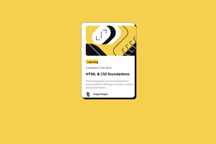
I just completed my second Frontend Mentor project, though parts were challenging. I was able to solve the issues and finish the work. How can I make the learning box change color when the user hovers their mouse over it? An answer would be helpful.

Community feedback

P

@wojtekbrejnak

Posted

Hello, @quantumloki! I came across your solution thanks to @abdellah-abadou, and I’d like to offer some constructive feedback. Allow me to share valuable tips that will serve you well in your future projects:

I. HTML Structure: Remember to properly structure your HTML documents using tags like <main><article><section><header><footer>, and <nav>. These elements enhance accessibility and maintainability. For instance, consider using <main> -> <header> + <section> + <footer> to streamline your code and improve readability.

II. Heading Order: Maintaining the correct order of headings (from <h1> to <h6>) is crucial. It ensures semantic clarity and assists screen readers. Avoid skipping heading levels—for example, going directly from <h1> to <h4> and <h5>.

III. Simplify CSS Selectors: Whenever possible, use element selectors to avoid unnecessary complexity in your code. For instance, if you’re targeting a .avatar class, consider leveraging the HTML structure (as mentioned in point 1) and directly target the footer.

IV. Custom Properties (Variables): Introduce custom properties (CSS variables) to enhance code readability and maintainability. While they may not be critical for smaller projects, adopting them early establishes good habits and makes your code more adaptable.

V. Avoid Absolute Units: Instead of using fixed units like px, opt for relative units such as em and rem. This approach ensures responsiveness across different devices and screen sizes.

VI. Avoid Floats: Embrace modern layout solutions like flexbox and grid. They provide more flexibility and scalability, allowing you to evolve as a developer.

VII. File Structure: Organize your .css files in a separate folder (e.g., styles or css) and name the file styles.css or style.css. A well-organized file hierarchy is essential for clarity, scalability, and ease of maintenance.

VIII. GitHub Documentation (README.md): Invest time in creating clear and informative README files for your projects. Following the Frontend Mentor blueprint is a great approach. Good documentation makes you a better developer and helps others understand your work.

IX. Meaningful Commit Titles: When committing changes, provide descriptive titles. Instead of generic titles like “Update index.css,” opt for specifics like “Style nutrition table.” Clear commit messages benefit both you and your future collaborators.

Keep up the great work, and best wishes on your coding journey! If you ever have any questions, feel free to reach out—I’m here to help. You can find my contact information in my profile. Keep coding and stay curious!

Marked as helpful

1

@abdellah-abadou

Posted

Take Look at @wojtekbrejnak's comment that it contains things that will help you develop your skills

1

@quantumloki

Posted

@abdellah-abadou I don't understand what you mean. Could you explain properly please?

0

@yayamdee

Posted

in order for your learning box to change color you should use the focus pseudo element and give it a color for the border ex: .learning:focus{ outline:red; }

1

Please log in to post a comment

Log in with GitHub
Discord logo

Join our Discord community

Join thousands of Frontend Mentor community members taking the challenges, sharing resources, helping each other, and chatting about all things front-end!

Join our Discord