Submitted 3 months ago
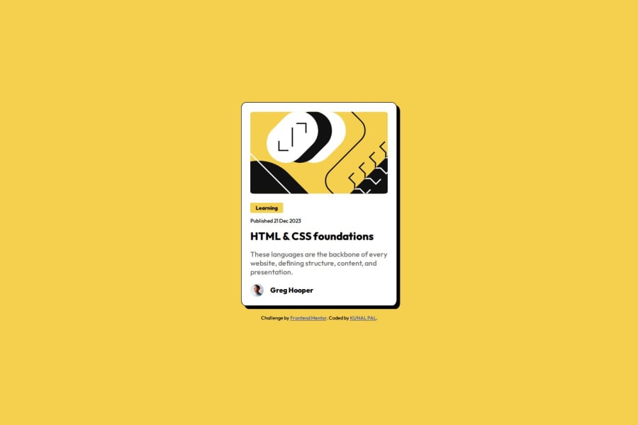
Responsive blog page using HTML and CSS
#accessibility#pure-css

@kunal90803

Design comparison
SolutionDesign

Solution retrospective
What are you most proud of, and what would you do differently next time?
I'm proud of myself as I am able to do everything on my own without taking help of CHAT-GPT or something. Next time I can create it more responsive and add more css effects.
What challenges did you encounter, and how did you overcome them?Actually this time I didn't face much problems as it is similar to previous tasks.
What specific areas of your project would you like help with?I need help where to use "rem" and where to use "px" while giving width and height.
Community feedback
- P@TranDanh1122Posted 3 months ago
- use px when this value never change, like card width { width 100%; max-width: 123px}
- use rem when you want it scale follow text size of device (fontsize, spacing, lettet spacing...v..v)
Marked as helpful0

Please log in to post a comment
Log in with GitHub
Join our Discord community
Join thousands of Frontend Mentor community members taking the challenges, sharing resources, helping each other, and chatting about all things front-end!
Join our Discord