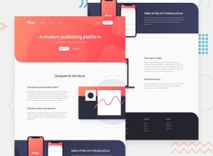
Responsive Blog Landing Page with Grid, FlexBox and SCSS
Design comparison
Solution retrospective
Any feedback is welcome.
Community feedback
- @antaryaPosted about 2 years ago
Hi 👋,
Nice job 🚀. Noticed a couple of things that can be improved.
CSS
[1. The header is not showing all links in some cases:
- 1000px width - Login link is hidden (no mobile toggle)
- 550px-880px width - Login and navigation links are hidden (no mobile toggle)
[2. When the mobile modal is open, navigation links do not expand to show inner child elements.
[3. Element with
.topclass hasmin-height: 80vh, on bigger screens text in the hero section is not centred vertically. Also at some point, if you start decreasing height, the login button of the hero section will be partially invisible. I think removingmin-heightand adding bottom padding will do the trick.[4.
Start for Freelike buttons have no pointer cursor and lack the animation you have on theLoginbutton.[5.
main section.content .contentBox .content_right .imgBox.image-leftis a bit long and redundant, you might benefit from using BEM https://getbem.com/naming/ e.g.info-section__imageand.info-section__image--left.[6. Spaces/sizes are a bit off; if you use a slider on the solution page, you can see the difference.
I hope this will be helpful.
Keep up the good work 🚀. Cheers!
Marked as helpful1
Please log in to post a comment
Log in with GitHubJoin our Discord community
Join thousands of Frontend Mentor community members taking the challenges, sharing resources, helping each other, and chatting about all things front-end!
Join our Discord
